Postcard produced by M&Co, ca. 1980
I acquired this postcard from Tibor Kalman in the early 1990s. We were often in touch and I built up a file of items and clippings about M&Co, his firm in Manhattan. I have no idea why the card has sustained so much wear and tear over the years. The other postcards I keep it with, many of them considerably older, are all in good condition. It does fit the image’s feeling of documenting a bygone era, though.
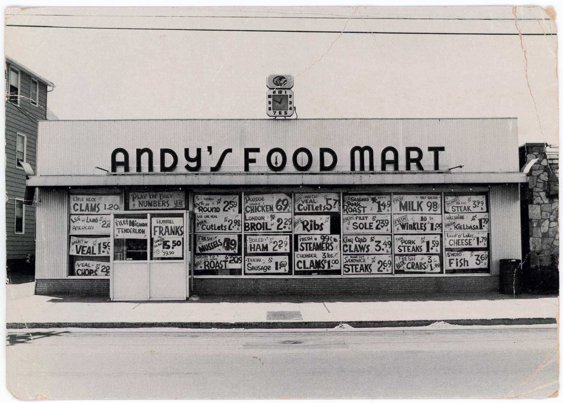
Nothing is printed on the back, and I assume that Kalman, rather than Andy’s Food Mart, had the photograph made into a card because he admired the look of the place: the confident flourish of the store name and the leaning “s”, the goofy clock poking its head up in the middle, and the enticingly hand-written placards for Italian sausage and king crab claws plastering the windows. The avoidance of color and the deadpan framing—Ed Ruscha couldn’t have done it any better—are exactly right for the subject.
The only reference online to the card is on the Cooper Hewitt, Smithsonian Design Museum website. In 1993, Kalman donated a copy, along with other M&Co materials. The museum’s entry dates it to ca. 1980, but it isn’t clear whether that’s for the photo, the printing, or both. No photographer is credited and the entry lists Kalman as “design director.” This presumably applies to the card’s production, rather than the creation of the window signs, but again it’s unclear. M&Co started in 1979 and Kalman cheerfully described the company in its early days as an outfit that “sold graphic design by the pound.”
In the 1980s and early 1990s, vernacular graphic expression—of which this is a prime example—was a recurrent and sometimes contentious topic in graphic design circles. For Kalman, the vernacular provided a benchmark of authenticity against which professional graphic design should be measured. In 1990, in collaboration with the journalist Karrie Jacobs, he wrote an essay for Print where they wax lyrical about the vernacular’s virtues and lessons. “Vernacular design is visual slang. [. . .] Vernacular design is so clear and simple that it seems to be from another time. [. . .] Vernacular design happens when a business takes care of its own design needs.” One example Kalman and Jacobs cite of the kind of message a business might be trying to communicate—“This is a store that sells sausages”—recalls M&Co’s evidently polemical postcard.
Located on Main Street in East Haven, Connecticut, Andy’s Food Mart was still doing business three decades later, although traces of the vernacular window displays were long gone when it was photographed in 2007. After substantial renovation, the owner restyled it as an “old world butcher shop” with a stylish canopy and a wooden storefront nothing like its unfancy origins. It’s safe to say that Kalman wouldn’t have felt inspired to put it on a postcard. A few years ago, it fell on hard times and closed.
For more on the intersection of design + food, pick up a copy of The Quarterly, Volume 1, Number 3: The Food Issue.
This essay was originally published in May, 2016.


Comments [2]
05.17.16
10:16
05.17.16
12:32