December 31, 2009
Utopian Image: Politics and Posters

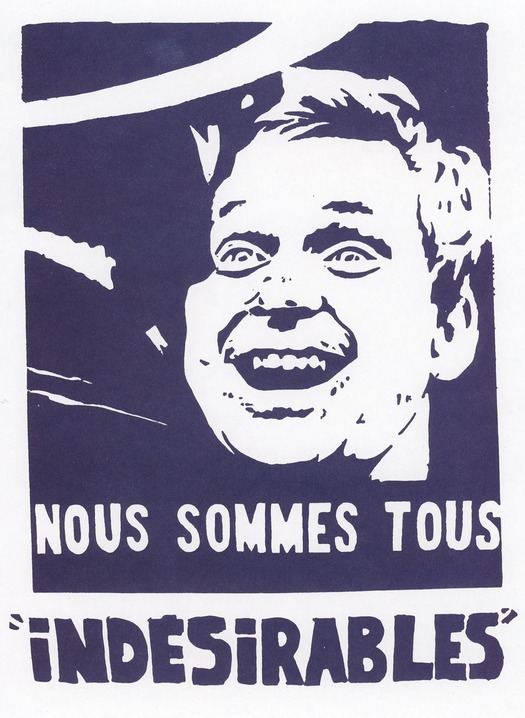
Atelier Populaire, We Are All Undesirables, poster, screenprint, 1968
In early May 2008, as the European media recalled the demonstrations that took place on the streets of Paris 40 years earlier, a telling display could be seen in the window of the Paul Smith fashion shop in Floral Street, London. To celebrate the anniversary, Smith — an enthusiast for all forms of popular culture — was showing a screen-printed poster produced by the Atelier Populaire, in support of the protests by French students and workers, mounted on a jagged slab of concrete. Inside, shoppers could buy an exclusive, hand-covered, hardback album, priced at £1,200 ($1,800) and limited to just 68 copies, consisting of 40 of the most powerful posters then on show at the nearby Hayward Gallery in an exhibition titled “May 68: Street Posters from the Paris Rebellion.” The soft white recycled pages were perforated along the spine so that the hand-printed posters could be removed and mounted on the wall. The book was also on sale at Paul Smith shops in Leeds, Paris, New York and Los Angeles.
The commodification of these revolutionary images was a possibility that participants in the Atelier Populaire, which began at the École des Beaux-Arts in Paris, both anticipated and rejected, refusing to put the posters on sale either during or after les événements. As they explained in 1969:
Their rightful place is in the centers of conflict, that is to say in the streets and on the walls of the factories.
To use them for decorative purposes, to display them in bourgeois places of culture or consider them as objects of aesthetic interest is to impair both their function and their effect. . . .
Even to keep them as historical evidence of a certain stage in the struggle is a betrayal, for the struggle itself is of such primary importance that the position of an “outside” observer is a fiction which inevitably plays into the hands of the ruling class. [1]
Yet 40 years later, the Atelier Populaire’s fears have come to pass, for what could be more bourgeois than a shop selling expensive trendy clothes? How many Paul Smith customers who saw the displays, let alone bought the album, would perceive these utopian images as anything other than attractively “edgy” decorative objects utterly divorced from political struggle? From the perspective of anyone involved in that struggle, could Paul Smith’s incongruous act of “celebration” within the framework of an international fashion brand be seen as anything other than a sign of the May uprising’s total failure? Nor was the Atelier alone in its concerns, in the late 1960s, about the speed with which revolutionary communications emerging from bourgeois society could be attacked at first, then neutralized and assimilated. “Capitalism transforms all objects, including art, into commodities,” writes Susan Sontag. “And the poster — including the revolutionary poster — is hardly exempt from this iron rule of cooption.” [2]

Niko (Antonio Pérez González), poster, screenprint, Cuba, 1968
In a collection of Cuban revolutionary posters published in 1970, Sontag points out how these images, regardless of their makers’ intentions, have become “one more item in the cultural smorgasbord provided in affluent bourgeois society,” their final resting place not the streets, town squares or factories, but the living room wall. [3] It was only a short step from the fashionable home to the equally bourgeois setting of the contemporary museum. In 1971, the Stedelijk Museum presented Cubaanse Affiches, a wide-ranging exhibition of Cuban posters still cited by experts in the field, with an accompanying catalogue. [4]
While the interest of an institution such as the Stedelijk in political posters from France or Cuba has the credible aims of scholarly understanding and public education, this curatorial enterprise cannot escape the Atelier’s words of warning. To step back from the political struggle to study its products with detachment is implicitly to accept the established order that makes this manner of study possible. For the museum, the posters are indeed “objects of aesthetic interest” taking their place in a collection that charts the formal evolution of the poster, as well as providing documentary evidence of their political moment. The Atelier Populaire posters have retained their exceptional fascination as examples of socially engaged image-making for three interrelated reasons. First, because of the anonymous and collective manner of their production. Second, because considered in purely formal terms, as combinations of well-honed copywriting and simplified imagery, they are singularly effective pieces of communication. Third, because of the concerted manner of their public use in the streets of Paris and elsewhere in France, which made them central to les événements and central, as a consequence, to the photographic documentation of the events by Magnum and other photographers. One might also add a fourth reason, which is the sum of all the others. For anyone inspired by the idea of using provocative graphic communication in the service of a radical or revolutionary cause, the posters continue to offer a paradigm of how such production techniques might be applied in other struggles. Even a poster’s depoliticized appearance in a clothes shop window offers evidence of how striking and original these 40-year-old pieces of ephemera still look as graphic images so many years after their creation.

Atelier Populaire, Paris, May 1968. Photograph: Philippe Vermès
The Atelier Populaire broke with the individualistic norms of both art and design practice, suppressing the bourgeois idea of personal authorship. The artist would no longer enjoy a privileged status, isolated from other workers in “an invisible prison.” [5] In a workshop teeming with activity, several students, paint brushes in hand, might collaborate on a design and posters were printed at great speed, around the clock — photographs by Philippe Vermès, one of the students, show rows of them drying on lines. “We’re there night and day making posters,” recalls Gérard Fromanger, another participant. “The whole country is on strike and we’ve never worked harder in our lives. We’re finally necessary.” [6]
Between 15 May and 27 June 1968, the Atelier Populaire des Beaux-Arts created more than 400 designs, while the Atelier des Arts Décoratifs created more than 100. [7] Estimates of the total number of copies put into circulation vary between 300,000 and 600,000. [8] The posters’ recurrent themes include the need for participation, continuing struggle, unity of the workers, strike action and the education of the people, as well as the iniquities of the production line, secret ballots, the “Gaullist cancer,” and the media — one poster in the Stedelijk’s collection shows a forest of TV aerials with the legend “L’intox vient à domicile” (Poison comes to the home). At the height of the protests, 10 million French citizens were on strike and the posters declare solidarity with metal workers, postal workers, boatmen and deep-sea fishermen. The designs are always constructed around the slogan. Their form is highly reductive, with crudely fashioned, cartoon-like imagery, which has great vitality and immediate communicative power, and rough, hand-drawn lettering. Most posters are printed in a single color: green, brown, purple, blue, red or black. The students wanted to avoid ambiguity and applied the most elementary criteria to every image: “Is the political idea sound? Does the poster put over this idea well?” [9]

Paris, May 1968. Photograph: Marc Riboud
A famous poster from the Stedelijk’s collection, showing the laughing face of radical student leader Daniel Cohn-Bendit, as he confronts a policeman in a helmet, exemplifies the Atelier’s graphic strengths. The half tones in Jacques Haillot’s news photograph, source for the image, have been “posterized” — simplified into black and white. In the Stedelijk version (one of several variants), the state’s menacing uniformed enforcer has become a dark blue hulk, while the gleeful features of Danny the Red, as he was then known, seem to glow with a wild light, an effect intensified by the close cropping of the original picture. The quickly drawn letterforms, mixing lowercase with capitals, suggest the urgent voices of protesters suddenly united in passionate resistance — “We are all undesirables” — to an inflexible authority determined to disregard and subdue them.

Daniel Cohn-Bendit, Paris, 1968. Photograph: Jacques Haillot
The speed and scale of production made possible what one commentator calls an “absolute interpenetration of art and event.” [10] The posters were a vital part of the struggle shared by students and workers, expressing its key ideas in the most direct public language available, inscribing the streets of Paris with these urgent messages, and attaining a level of visibility and impact on the consciousness of spectators, in some locations, normally achieved only by commercial advertising. Examining the idea of utopia in relation to modernism, Christine Lodder distinguishes between several types of alternative world: spiritual, Dionysian, rational, political, communist and social. She characterizes social utopias, the most relevant form for this discussion, “as those visions formulated within the context of capitalist societies, which therefore embody an element of aspiration and struggle, are related to the perceived evils of the present and include strategies for attaining utopia within the limitations of the existing social structures.” [11] This precisely describes the role played by the Atelier Populaire’s posters in May 1968. The students’ well-organized campaign of graphic rebellion, still an unusual event in the history of visual communication, can be seen as a genuinely utopian moment, like the upsurge of political longing that it expressed.
 Atelier Populaire, Paris, May 1968. Photograph: Philippe Vermès
For Pierre Bernard, Gérard Paris-Clavel and François Miehe, the founding members of Grapus, formed in Paris in 1970, their experiences in the second Atelier Populaire at the École des Arts Décoratifs in May 1968 would be a formative influence. Miehe, a committed communist, had taken a leading role in the graphic workshop and Bernard identified with his dedication to the working class.
Those interests, I believed, would be in better hands with the PCF [French Communist Party]. . . . As a designer I wanted to work for the forces of revolution. My artistic ambition and my vocabulary as a designer, I expected, could come into their own in the service of the party. [12]
The name Grapus, a play on the words crapules staliniennes (Stalinist scum), was both a gesture of political allegiance and a sardonic provocation to potential critics. One criticism that has been made of the Atelier Populaire posters (and of similar protest posters) is that their visual lexicon of clenched fists and factory roofs offer an old-fashioned representation of reality. In Robert Philippe’s view, “They have the same communicative value as the antiquated post horn in the international series of road signs.” [13] This, he argues, is a needless limitation of visual communication. Bernard’s La police vous parle poster, designed at the Atelier, shares this directness — its sinister, dark-eyed cop barking into an ORTF microphone simply illustrates the verbal image — but the formal devices used by Grapus in the 1970s and later mark a significant expansion in the graphic vocabulary of the politically engaged poster.

Atelier Populaire, This is the Police Speaking, poster, screenprint, 1968
In the mid-1960s, both Bernard and Paris-Clavel had studied with Henryk Tomaszewski at the Warsaw Academy of Art. The Polish master’s posters were notable for a strong emphasis on his own hand as a visible shaping force in the design combined with an extreme economy, an almost aphoristic compression, of form. In a poster for a Henry Moore exhibition (1959) Tomaszewski carves the sculptor’s name from white paper shapes that become sculptural elements in their own right, and treats one as a pedestal for a sculpture. While little of Moore’s work is shown, the graphic construction, most of it comprising empty blue space, still conveys a sense of the British artist’s formal and spatial concerns. [14]

Henryk Tomaszewski, Moore, poster, offset, Poland, 1959
“I learnt from Henryk Tomaszewski that ‘the economy of means is founded on the richness of thought,’” notes Paris-Clavel. [15] Bernard and Paris-Clavel were already steeped in the calligraphic tradition of Polish poster design, represented by Tomaszewski better than anyone, when they took part in the Atelier at Arts-Déco. Their predilection for the handmade image, for the splatter, the blotch and the explosively scribbled line, would become the basis of their graphic method as Grapus. This work was, however, much more than merely gestural: Grapus’s effectiveness as graphic activists came from their understanding of meaning and how to manipulate it. “We discovered semiology and it was very important to us,” says Bernard. “It allowed us to deconstruct images, so we could say to political commissioning bodies: ‘We are going to make images for you which will have real meaning. We are going to make true political images.’” [16]
In a monograph about Bernard, Hugues Boekraad argues that Grapus negotiated an “erratic middle course” between two design strategies: demystification, in Barthes’ sense of exposing the myths by which we live, and a utopian impulse to imagine an alternative order that is unattainably distant from present reality. [17] Yet one might also propose that the work’s very existence, the autonomy it claims, the example it provided to others at the time of creation and, later, as a model for possible practice, can also be considered in utopian terms. Grapus’s output is, in other words, a kind of proposal. As with modernism, its radically informal method of composition, the stylistic collisions and casual violations of image and surface, embody a new way of thinking and a new set of values.

Grapus, Expo Grapus, poster, offset, 1982
A poster Grapus produced to represent the studio, for a retrospective in Paris in 1982, can be interpreted as a kind of manifesto. They were internationally celebrated as designers by this stage, but their body of work bore no relation to the orderly, well-mannered modernism seen in the work of contemporaries operating at a comparable level of achievement and acclaim. [18] Their exhibition poster is much closer in form and spirit to the anarchic impulses, cultural irreverence and indifference to good taste found in punk graphics of the period. At the most obvious level, this can be seen in the scribbled lines, dabs of crudely slapped on color, and rejection of formal typography for clumsily scrawled handwriting. The poster’s only precisely drawn and formal graphic element, the arrow saying “Expo,” is gripped in the grinning figure’s mouth, making it clear that any engagement with design conventions will have to be conducted on Grapus’s own terms. They make their communist sympathies fully evident by placing the Soviet hammer and sickle opposite the French national colors, and turning it into a winking eye, and they invoke the libidinal energy (and imagery) that runs through their work by means of a pubic hair nose and the painted breast-like shapes that form the shoulders. The jocular iconoclasm and slightly threatening demeanor of an image that appears to have sprung into view like a jack-in-the-box is underscored by satirical allusions, within the same ambivalent figure, to the Smiley face, Disney’s Mickey Mouse and Adolf Hitler. In both form and content, this and other posters enact an ideal of social, cultural and personal freedom that would prove to be difficult to sustain as French politics moved to the right in the course of the 1980s.

Grapus, Let’s Go, poster, offset, 1976
Grapus avoided working for the commercial sphere, preferring to commit its efforts to the PCF, to which all of the members belonged at the outset, the Confédération Générale du Travail (CGT), a Communist trade union, and to other progressive organizations and causes, such as theater companies, social institutions, educational initiatives and town councils. Jean-Paul Bachollet and Alex Jordan joined in the mid-1970s and Miehe left in 1978. The group continued to operate collectively, with each piece of work being attributed simply to “Grapus.” A quintessential image from this period is the On y va (Let’s Go) festival poster they designed in 1977 for the PCF’s youth section, the Jeunesse Communiste. The massive sans-serif lettering of the title gives the announcement great authority and the rainbow-like gradations of color filling the letters turn them into windows that seem to offer an optimistic glimpse of a brighter future with the party. The informal handwritten additions, scattered like graffiti across the solid, symmetrical structure, invite the viewer to participate and become involved in discussion. Grapus’s poster reveals an awareness of the importance of image to the communication of political ideas that was years ahead of its time. In reality, the party did not want Grapus to reinvent its image, either then or later, because according to Grapus, it had no idea what image it was trying to project. [19] Although the group worked on occasional campaigns for the PCF, the party never gave them overall responsibility for its visual identity. In 1985, Bachellot, who had been a member of the PCF for more than 30 years, described Grapus’s way of handling the political organizations they worked for:
I did not want to become part of a situation in which one loses one’s freedom of opinion and one’s freedom of power. This means that a trade-union leader or a politician who comes and visits us will be respected, but he will not have any power at all. He will have the power to convince, not to impose. [20]

Grapus with Michel Quarez, Festival of Youth!, poster, offset, 1976
By this time, Grapus was no longer working for the Communist party. From the mid-1980s, starting with an identity for the Parc de la Villette, the group began to engage with larger institutional clients. While some members still wanted to design only for political causes, Bernard felt that graphic communication could be an instrument of change when applied to social institutions. Paris-Clavel, on the other hand, was unhappy about the way that big institutions “confiscate and reclaim” the meaning of even the most radical designers’ work in their own interests, and end up “filtering reality.” [21] The turning point came with a commission to design an identity for the Louvre. Grapus now employed 20 people; it had become a business.
“We could either continue as an agency — making a profit but losing our capacity to agitate — or we could separate,” recalls Paris-Clavel. [22] On January 1, 1991, Grapus disbanded. Bernard then began a new studio, Atelier de Création Graphique, and Jordan committed himself to Nous Travaillons Ensemble (We Work Together), which he had started in 1989 within Grapus. [23] Paris-Clavel, pursuing the most uncompromising course, founded a not-for-profit association, Ne Pas Plier (Do Not Bend), restating political aims and ideals closely allied to those of the Atelier Populaire. The group, consisting of artists, architects, social workers and economists, set out not to create “graphic design,” but to produce and distribute texts and images about social and political issues. As they explained:
For Ne Pas Plier, an image is not an inert object to be contemplated, nor is it a political tool in itself. Only when inserted into action or struggle does it produce political effects; only when carried by individuals or groups does it come alive, generating meaning in return. The static image, frozen on the wall, is countered by an image that is carried, used, overwritten, et cetera — drawn into a social and human dynamic. Leave behind the museum space for the stage of social struggle, refuse the rules, values, and categories of the art market, abolish the artist’s proud solitude through work conceived as coproduction, reverse the fetishism of the original and of the unique piece by proposing “images whose original is multiple,” adopt the principle of free exchange to the point of giving the images away for free rather than selling them: these are the guiding ideas of Ne Pas Plier. [24]

Grapus (Gérard Paris-Clavel), poster, screenprint, 1989
In 1989, while still a member of Grapus, Paris-Clavel created a poster that shows a starving African child with Mickey Mouse ears formed from inverted images of the globe to suggest an infantilized corporate worldview. He traps the boy’s emaciated face between the accusatory words “Money World.” Refusing to offer viewers the escape route or consolation of aesthetic pleasure, which can often disarm the campaigning anger of political posters, this brutal, almost disrespectful montage is extremely uncomfortable to look at. Colleagues criticized Paris-Clavel for depicting suffering so shamelessly, but the poster proclaims an outrage against humanity that should cause universal offence and, once seen, it cannot be forgotten. “This image is less unbearable than its reality,” counters Paris-Clavel. “This child dies as a victim of someone else’s decision to sell him. . . . This world is despicable, let’s resist it and change it!” [25]

Adapted poster image shown in Ne Pas Plier s.v.p. catalogue, Stedelijk Museum, 1995
It is hard to imagine that such a troubling poster could ever become a sought-after saleroom commodity or turn up in a fashion shop window. Ne Pas Plier’s work always drives home its messages with images of unmitigated bluntness, dismissing any notion that the viewer might be too “fatigued” by more news of grim reality to muster the will to respond. The work’s humanistic assumption is that people are still capable of passionate engagement in causes that matter without it being necessary to soften the message, or make it more palatable. An image called Urgent-Chômage (Urgent-Unemployment) shows two heads aflame with enthusiasm as they restate the ideals of liberty, equality and fraternity. This was inspired by the words of an unemployed person: “It’s like a fire in your head, then an explosion.” [26]
By 1995, Ne Pas Plier had produced several thousand copies in the form of posters, tarpaulins, self-adhesive prints, and petition cards demanding aid for the unemployed as they applied for benefits, and the image was often carried at demonstrations by APEIS (Association Pour l’Emploi, l’Information et la Solidarité). Paris-Clavel and his Ne Pas Plier colleague Marc Pataut, a photographer, would march with the jobless, too. The problem with many political posters created by well-meaning designers is that they never reach their target: they influence no one and change nothing. For Paris-Clavel, it was the act of distribution, not just the content of the images, which made them political, and the quantities were equally significant. “With ten images you might get into specialized magazines, you might be called an artistic progressive. But with 40,000 you are using a social, person-to-person approach to distribution.” [27] Here, once again, Paris-Clavel’s practice as an activist recalls the lessons of May 1968.

Urgent-Unemployment poster image used in a demonstration by APEIS, Paris, 1996. Photograph: Marc Pataut
Paris-Clavel’s manner of operating with Ne Pas Plier was self-consciously utopian. He doubted that democratic and cultural institutions could be relied upon to generate and distribute genuinely radical ideas, and he used the word “utopia” to describe the economic independence from institutions and major commissions that he now believed was essential to pursue his aims as a militant. (Later, Ne Pas Plier would sometimes collaborate with public institutions.) To express his hopes, Paris-Clavel borrowed the phrase “Utopia of Possibilities” from a book by the philosopher Paul Ricoeur, and, in a Stedelijk Museum catalogue, he quoted Ricoeur’s view that, “Utopia is constructed from the memory of things which one has not yet achieved.” [28] The image of utopia also became the basis of a series of cards widely distributed by Ne Pas Plier: “Utopiste à l’arrêt” (Utopian on pause), “Utopiste debout” (Upstanding utopian), “Apprenti utopiste” (Apprentice utopian). As theorist Brian Holmes, a member of Ne Pas Plier from 1999 to 2001, explained, these prints were meant to facilitate and multiply hand-to-hand exchange,
. . . to give as many people as possible the chance to create meaning with signs that are specifically oriented and yet open, unmanipulative — the opposite of advertising signs that seek to channel vital energy into unconscious behavior. Culture as a way for human beings to express their solidarity with each another. [29]
Ne Pas Plier’s posters and placards shared this purpose and protesters used them in the same way. Working with others in friendship, living alongside them, sharing their emotions and collaborating with them in social struggle was also a utopian ideal. In Paris-Clavel’s view, “social and artistic work doesn’t hang in museums. It moves with people, it lives in encounters and exchanges.” [30]
This assertion captures the unavoidable paradox of the political poster. Despite the distance it seeks to place between itself and the gallery wall, even Ne Pas Plier’s work has been collected, catalogued and, in some sense, contained. It joins posters by the Atelier Populaire, Grapus and Nous Travaillons Ensemble in the Stedelijk Museum not only because it belongs to the same lineage, but because, like those posters, it stands out as exceptional of its kind. The curatorial challenge is to convey to the viewer, who may know nothing about the original context of any of these posters, and may have only the vaguest impression of the causes and passions behind them, that they represent moments of refusal, resistance and hope for necessary change. Today, thanks to the influence of designs like these, the handmade poster is a well-established graphic vernacular within the landscape of international visual communication. [31] Nevertheless, to view these images purely as influential examples in the history of graphic style is to turn a blind eye to the utopian visions they affirm. While the posters’ expressive qualities were vital to the way they communicated, their reason for existing was to inform, inspire and mobilize their viewers. If it is in the nature of institutions, standing at a remove from the action, to filter and subtly distort reality, then this is one area in which the museum should endeavor, as a matter of public and political necessity, to resist itself. Viewers must understand these images as documents of a continuing struggle.
This essay appears in Stedelijk Collection Reflections (2012) published by Stedelijk Museum Amsterdam and nai010 Publishers. It is republished here with permission. Some illustrations have been changed.
See also:
Why the Activist Poster is Here to Stay
1. Atelier Populaire, Posters from the Revolution. Paris, May 1968 (London, 1969), n.p. See also Les Affiches de Mai 68 ou L’Imagination Graphique, exh. cat. (Paris: Bibliothèque Nationale, 1982); and M. Rohan, Paris ’68: Graffiti, Posters, Newspapers & Poems of the Events of May 1968 (London, 1988). For a general history of French graphic design, including the Atelier Populaire, see M. Wlassikoff, The Story of Graphic Design in France (Corte Madera, 2005).
2. S. Sontag, “Posters: Advertisement, Art, Political Artifact, Commodity,” in M. Bierut, J. Helfand, S. Heller and R. Poynor (eds.), Looking Closer 3: Classic Writings on Graphic Design (New York, 1999), 214. Originally published in D. Stermer, The Art of Revolution (New York, 1970).
3. Ibid., 218.
4. Cubaanse Affiches, exh. cat. (Amsterdam: Stedelijk Museum, 1971).
5. Atelier Populaire, Posters from the Revolution, op. cit., n.p.
6. G. Fromanger, “L’art c’est ce qui rend la vie plus intéressante que l’art,” Libération, 14 May 1998. Quoted in K. Ross, May ’68 and its Afterlives (Chicago, 2002), 16.
7. M. Wlassikoff, Mai 68: L’affiche en heritage (Paris, 2008), 25.
8. J. Carrick, “The Assassination of Marcel Duchamp: Collectivism and Contestation in 1960s France,” Oxford Art Journal, 31 (2008) 1, 22.
9. Atelier Populaire, Posters from the Revolution, op. cit., n.p.
10. Ross, May ’68 and its Afterlives, op. cit., 16.
11. C. Lodder, “Searching for Utopia,” in C. Wilk (ed.), Modernism: Designing a New World 1914-1939, exh. cat. (London, 2006), 34. See also V. Margolin, The Struggle for Utopia: Rodchenko, Lissitzky, Moholy-Nagy, 1917-1946 (Chicago, 1997).
12. Quoted in H. Boekraad, My Work is Not My Work: Pierre Bernard: Design for the Public Domain (Baden, 2008), 104.
13. R. Philippe, Political Graphics: Art as a Weapon (Oxford, 1982), 282.
14. See Henryk Tomaszewski, exh. cat. (Amsterdam: Stedelijk Museum, 1991).
15. U. Held, “Gérard Paris-Clavel,” Eye 27 (1998), 13.
16. R. Poynor, “Pierre Bernard,” Eye 3 (1991), 10.
17. H. Boekraad, My Work is Not My Work, op. cit., 80.
18. See, for instance, the selection of work by 18 international designers in F.H.K. Henrion, Top Graphic Designers (Zurich, 1983). As well as Grapus, the book includes work by Otl Aicher, Alan Fletcher, Shigeo Fukuda, Rudolph de Harak, Bruno Monguzzi, Odermatt & Tissi, Henryk Tomaszewski, and Wolfgang Weingart.
19. J. Wesselius, “Grapus: The Image of Pleasure and the Pleasure of the Image,” in Grapus 85: Various Different Attempts (Utrecht, 1985), n.p.
20. Quoted in ibid, n.p.
21. G. Paris-Clavel, Ne Pas Plier s.v.p., exh. cat. (Amsterdam: Stedelijk Museum, 1995), n.p.
22. Held, “Gérard Paris-Clavel,” op. cit., 10.
23. See F. Robert, Nous Travaillons Ensemble (Paris, 2003).
24. G. Paris-Clavel, “Everything is Possible,” in J. van Toorn (ed.), Design beyond Design: Critical Reflection and the Practice of Communication (Maastricht, 1998), 101-102.
25. Paris-Clavel, Ne Pas Plier s.v.p., op. cit., n.p.
26. B. Holmes, “Ne Pas Plier — Déplier / Do Not Bend — Unfold,” in k-bulletin 3 (2000), n.p.
27. Held, “Gérard Paris-Clavel,” op. cit., 12.
28. P. Ricoeur, L’Idéologie et l’utopie (Paris, 1997); and G. Paris-Clavel, Ne Pas Plier s.v.p., op. cit., n.p.
29. Holmes, “Ne Pas Plier — Déplier / Do Not Bend — Unfold”, op. cit., n.p.
30. G. Paris-Clavel, “Utopia of Possibilities,” in Van Toorn, Design beyond Design, op. cit., 32.
31. See S. Heller and M. Ilić, Handwritten: Expressive Lettering in the Digital Age (London, 2004); and F. Studinka (ed.), Poster Collection 11: Handmade (Zurich, 2005).
Observed
View all
Observed
By Rick Poynor
Related Posts

Business
Courtney L. McCluney, PhD|Essays
Rest as reparations: reimagining how we invest in Black women entrepreneurs
Design Impact
Seher Anand|Essays
Food branding without borders: chai, culture, and the politics of packaging
Graphic Design
Sarah Gephart|Essays
A new alphabet for a shared lived experience
Arts + Culture
Nila Rezaei|Essays
“Dear mother, I made us a seat”: a Mother’s Day tribute to the women of Iran
Recent Posts
Minefields and maternity leave: why I fight a system that shuts out women and caregivers Candace Parker & Michael C. Bush on Purpose, Leadership and Meeting the MomentCourtney L. McCluney, PhD|Essays
Rest as reparations: reimagining how we invest in Black women entrepreneurs Food branding without borders: chai, culture, and the politics of packagingRelated Posts

Business
Courtney L. McCluney, PhD|Essays
Rest as reparations: reimagining how we invest in Black women entrepreneurs

Design Impact
Seher Anand|Essays
Food branding without borders: chai, culture, and the politics of packaging

Graphic Design
Sarah Gephart|Essays
A new alphabet for a shared lived experience

Arts + Culture
Nila Rezaei|Essays

 Rick Poynor is a writer, critic, lecturer and curator, specialising in design, media, photography and visual culture. He founded Eye, co-founded Design Observer, and contributes columns to Eye and Print. His latest book is Uncanny: Surrealism and Graphic Design.