
January 20, 2016
The D Word: Titling Type
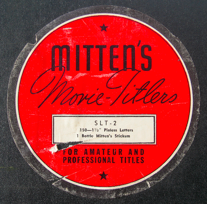
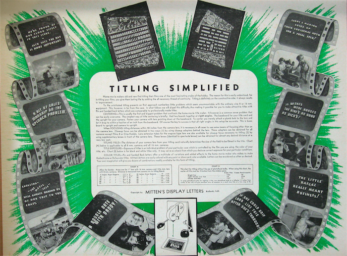

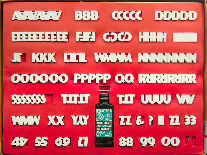
Systems for lighting were surprisingly elaborate to achieve the “hot spot” and capture the best possible shadow to increase dimensionality. They may lack the grace of printed letterforms but Mitten’s tri-dimensional bulk, when cross-lighted to achieve shadows with dramatic effect, were usually clear and readable.
Observed
View all
Observed
Share on Social
By Steven Heller
 Steven Heller is the co-chair (with Lita Talarico) of the School of Visual Arts MFA Design / Designer as Author + Entrepreneur program and the SVA Masters Workshop in Rome. He writes the Visuals column for the New York Times Book Review, a weekly column for The Atlantic online and The Daily Heller.
Related Posts

Graphic Design
Sarah Gephart|Essays
A new alphabet for a shared lived experience

Arts + Culture
Nila Rezaei|Essays
“Dear mother, I made us a seat”: a Mother’s Day tribute to the women of Iran
The Observatory
Ellen McGirt|Books
Parable of the Redesigner

Arts + Culture
Jessica Helfand|Essays
Véronique Vienne : A Remembrance
Recent Posts
Mine the $3.1T gap: Workplace gender equity is a growth imperative in an era of uncertainty A new alphabet for a shared lived experience Love Letter to a Garden and 20 years of Design Matters with Debbie Millman ‘The conscience of this country’: How filmmakers are documenting resistance in the age of censorshipRelated Posts
Graphic Design
Sarah Gephart|Essays
A new alphabet for a shared lived experience
Arts + Culture
Nila Rezaei|Essays
“Dear mother, I made us a seat”: a Mother’s Day tribute to the women of Iran
The Observatory
Ellen McGirt|Books
Parable of the Redesigner
Arts + Culture
Jessica Helfand|Essays