
December 31, 2009
How to Visualize Poetry — And How Not to
Having known next to nothing about visual poetry when I picked up an anthology of it this past year, I thought that I’d find one of two things in it: poems with drawings on them in the old tradition of illuminated books; or elaborate graphic representations of poems, backward ekphrases of, I don’t know, the river Acheron in Rothko paint. I even hoped that the book would be made up of objects beautiful in the way that poems are beautiful, would be full of intricately ambivalent street art or particularly inward sticks in the road. Needless to say, I was wrong for the most part. The poems (or whatever they are) in The Last Vispo — the pieces — don’t make up poems with visual means but make the means of poetry visual in what the poets (artists?) clearly think are unordinary, visceral ways. There are, for instance, many drawings of commas (“Comma-ism”), an “o” in the forest, a junkyard of rusty “e”s. (I never thought that I’d see an “e” eat one of its kind.) Letters are made of people posing and pour out of people’s wounds (viscerally); they are typed, drawn, painted, pasted, built, and rendered, solid and porous and squiggly, made strange or unrecognizable, Rorschach blots of typography.

Mark Sutherland’s “Speechless”
This is “poetry liberated from the hegemony of denotation and connotation,” according to the editors, and what’s a manifesto of a self-styled movement without liberation rhetoric and vague abstractions to set its art against everything else ever done? “Poetry must realize that reading is changing,” an editor writes. “My 14 year old son watches ESPN as he scans the internet on his laptop for related articles, chatting with friends on Facebook on his iPod, sending and receiving text messages — multi-texts, multiple modes/platforms, intertextuality at what some argue occurs at an insane, unsustainable pace.” Reading a visual poem “instructs us on how to gather meaning from the intensifying synaptic flashes of our internal and external world.”
The main irony of this stuff is that the editors are right about the ends only when they’re wrong about the means. They’d like us to see the act of reading as if it were unfamiliar, as if we could read over our own shoulders. We notice our habits when we engage in them without habitual results. But not all frustrated habits are equally revealing, and when the visual poems are free of denotation and connotation, when they don’t refer to anything or hint at much of anything and are just jumbles of semi-legible text on a page, they start to read like tennis without a net or a ball or a racket. How much depth and range can there be to the disorder of entirely disordered language? What could be more familiar?

Derek Beaulieu’s “Untitled”
The worthwhile visual poems on display don’t turn up their greater-than symbols at “the ho-hum regimentation of linear normalcies.” They take a significant form and deform it — a picture of meat, a haiku, Facebook on iPods. (There is no Facebook on iPods, no matter what our editor tells us.) A small square snapshot of a raw steak, Mike Cannell’s “Relationships” has “meat/meet/metre” written on it in bold, as if telling the progression of human relationships from lower to higher, from animalistic to social to cultivated like metre. A snapshot of our sense of a poem, it leaves us with the poem’s major linguistic relationship, the rhyme, and the image that the rhyme would jar our minds into fixating on: the meat. Scott Helmes’s “Haiku” has three horizontal roughly parallel lines of cutout paper, each with three clippings in different colors and with cutoff text, all linked by crisscrossing lines of paint in overlapping colors. The three lines, the small number of parts, the many connections between them all: this is how a haiku looks if you abstract away from its content, or if you just don’t get the one that you’re trying to read.
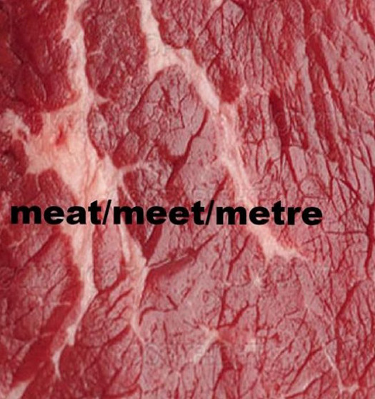
Mike Cannell’s “Relationships”

Scott Helmes’s “Haiku”
Of the pieces worth paying attention to, almost none deal mostly with letters (the rare exception being Judith Copithorne’s “The Letter O,” a black-and-white drawing of “o”s falling like snow, in which the letters are at once a convincingly drawn object and the means of representing it, as well as part of how our language represents the object [part of “snow”] and how we may react when we see it, with a sound like “oh,” if that isn’t too much of a stretch and if it’s a nice snowy day). A number of the better pieces play on poetic form, like “Haiku” and “Relationships,” but other forms of language work just as well, like braille. That’s the subject of “Hh,” by Fernando Aguiar, who to judge from this collection makes pieces that are to visual poetry roughly what God is to other gods before Him. “Hh” is a sheet of braille painted over in what looks like green and blue highlighter with some “h”s painted over it, along with an “i” and an “m” and some “n”s. A riddle: who would think of both braille and the Latin alphabet? The reader dependent on braille misses the signs that leap out at us, as we miss out on her symbols. If the blind reader could see for the first time, our letters would seem like strange symbols to him, as his symbols look to us. To look at “Hh” is to slip into seeing your language as strange, as if you were relearning the alphabet. (The letters, “hi” and “mn,” are even in order.)
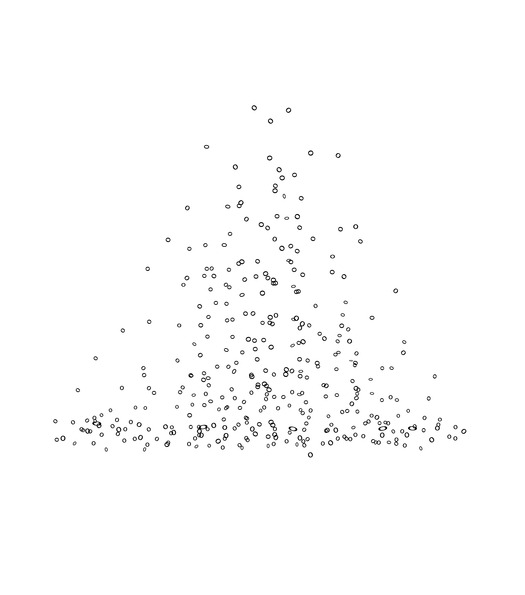
Judith Copithorne’s “The Letter O”

“Hh,” by Fernando Aguiar
These pieces are striking. They aren’t especially deep, but they do slide in under your consciousness memorably in the way that billboards do and poems usually don’t. This is because they’re meaningfully disorienting, where the mass of forgettable vispo disorient you in trivial ways — and not just the alpha-numeric-character art. Keiichi Nakamura’s “0 or” has a bunch of binary code in between a pair of bared feminine legs and an elephant trunk. The trunk, we gather, is a phallus, the other side of a gender binary, the 1 to her 0. But who the hell cares? Instead of cultivating an experience he’ll complicate, Nakamura gives us a cartoon. Too many pieces in Vispo share this emotional laziness of carelessly imagining audience reactions, which, when coupled with a faith in rule-breaking for its own sake, leads to the kind of adolescent sensibility that finds something sexy and transgressive in quirky shock humor. (“Clitoral yamulka [sic].”) Far be it from me to censor or censure sketches of sign-dummies humping, but they should be put in their rightful place: the margins of high-school textbooks.
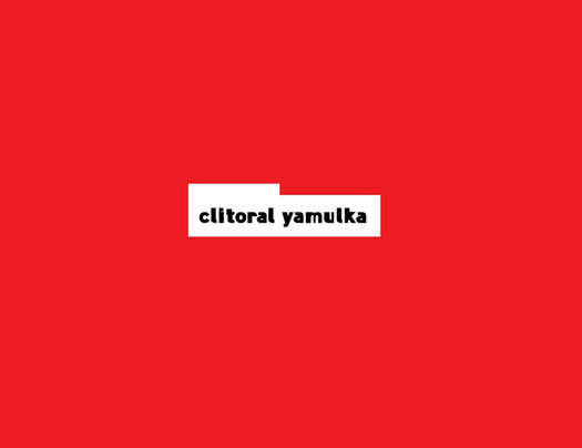
Bruce Andrews’s and Dirk Rowntree’s “clitoral yamulka”

Suzan Sari’s “As Bad As Making Someone Give Up A Decided Suicide”
Like any new art form whose practitioners care more about it than the art they can make with it, visual poetry can be better in concept than in practice. A number of titles, for instance, are hopelessly better than the pieces that illustrate the ideas — “Fluorescent Hunting Knives,” “Diamond Bullet Shatters Abstract Cataract,” “The Jazzercise Dance of Hope.” Some pieces seem as though they were conceived as visual poems but made as just visual art, like David Baptiste Chirot’s “Death From This Window,” which looks like an anticipated death from falling through a window, the blood and dirt superimposed on the still-intact glass. This is cool as far as it goes, but where is the poetry?

“The Jazzercise Dance of Hope”
It’s very much there in Aguiar’s “Ecologic Sonnet,” a piece as intricate as poetry itself. The sonnet measures 110 by 36 meters and is made of seventy trees. For once, the world represents art — the grassy quatrains, the identical benches facing each other like rhymes, the trees like themes, dispersed, with “yellow leaves, or none, or few.” Not that it’s an illustration of Shakespeare’s sonnet 73 or of any other poem: the trees barely hint at the poem’s subject (if it even makes sense to speak of trees’ subjects). But it’s our habit to read not just for the form of a poem but for its content, for what the yellowing says about mortality or the number of trash cans about the persistence of folly. We engage in our habits as the piece complicates them, as the best visual poetry does.

“Ecologic Sonnet”
Observed
View all
Observed
By Adam Plunkett
Related Posts

Civic Life
Bert de Muynck|Essays
Walkie talkie: An architect-turned-tour guide on designing presence in Lisbon

Business
Courtney L. McCluney, PhD|Essays
Rest as reparations: reimagining how we invest in Black women entrepreneurs

Design Impact
Seher Anand|Essays
Food branding without borders: chai, culture, and the politics of packaging
Graphic Design
Sarah Gephart|Essays
A new alphabet for a shared lived experience
Related Posts

Civic Life
Bert de Muynck|Essays
Walkie talkie: An architect-turned-tour guide on designing presence in Lisbon

Business
Courtney L. McCluney, PhD|Essays
Rest as reparations: reimagining how we invest in Black women entrepreneurs

Design Impact
Seher Anand|Essays
Food branding without borders: chai, culture, and the politics of packaging

Graphic Design
Sarah Gephart|Essays

 Adam Plunkett is the poetry editor of Design Observer and the assistant literary editor of The New Republic.