
June 22, 2023
Type is (More Than) Image
From record albums and book covers, to editorial illustration and identity programs, to three-dimensional environmental graphics all over the world, typography has always stood at the core of Paula Scher’s work. As prolific as she is playful, she reminds us what is possible when a smart, self-aware, and endlessly imaginative mind is put to good use.
Now, a magnificent new retrospective exhibition opening today in Europe gathers highlights from Scher’s unparalleled career, uniting graphic design, architectural installation, typographic innovation, and no shortage of visionary spectacle. Paula Scher: Type is Image will be on view for the next year at Pinakothek der Moderne in Munich.
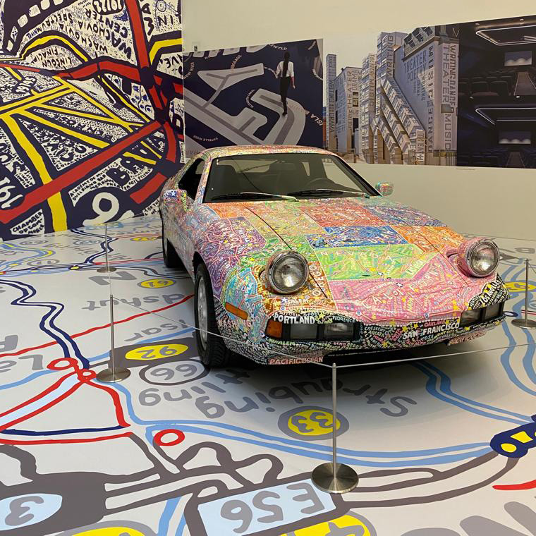
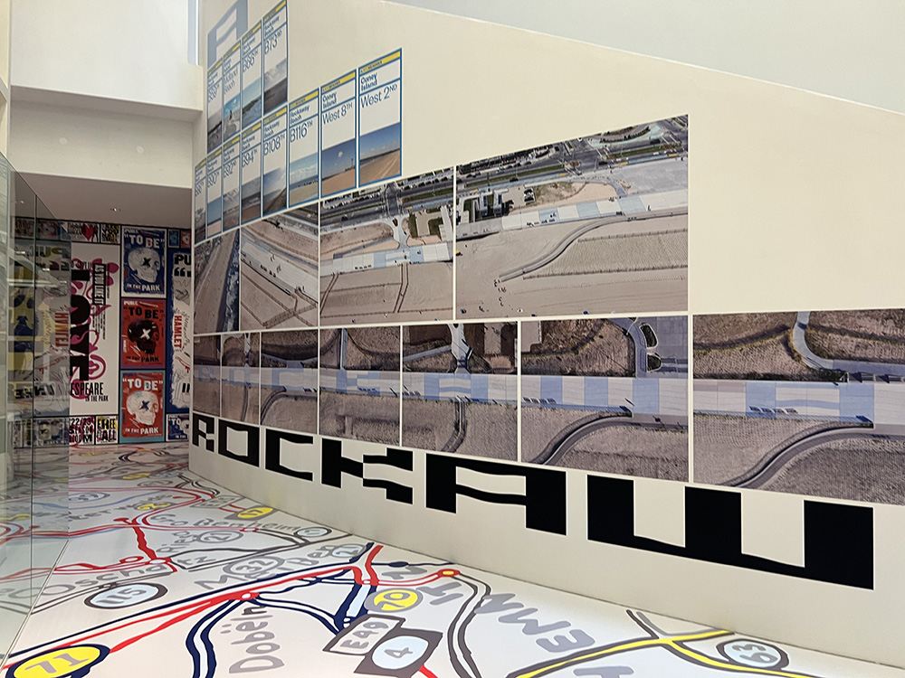
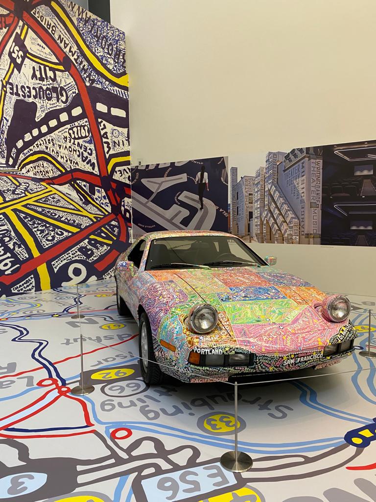
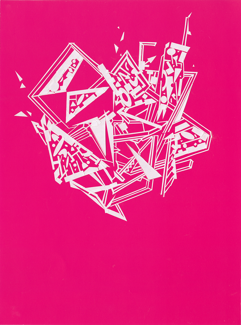
Fearless about scale, about site, and about visual explorations of form, Paula Scher’s ability to serially reinvent herself may well be her most dazzling characteristic: she’s curious as a thinker, capable as a maker, and in possession of a process at once creatively restless and formally rigorous. She questions logically and builds architecturally. She thinks in letterforms and constructs at scale. A single letter, to Scher, can be characterized by the presence of its strokes, or by the absence of its counterforms: it is a living thing, a kind of raw material ready to be infused with wit, injected with meaning, inserted into any of a number of bespoke choreographic routines. It can spell (a word) or signify (a logo) or expand (to full alphabet presence, where its subsequent roles are limitless). It can invert or subvert; jiggle or jostle or spin. It can rotate, mutate, and reveal itself anew. In her mind, two dimensions migrate easily to three: for a car collector, Scher produced a hand-drawn map, painted onto the surface of a Porsche. At her hand, three dimensions easily become four: for a site-specific project on a restored New York coastline, she conjured massive letterforms, visible only from the air. (The entire floor here is another hand-drawn map, enveloping viewers in a envelope of the designer’s own inimitable visual language.)
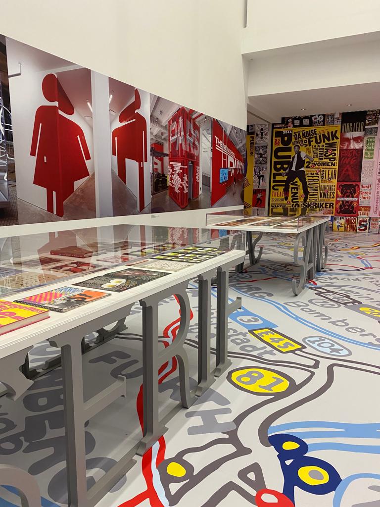
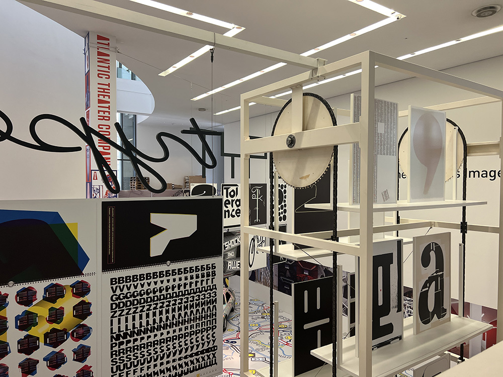
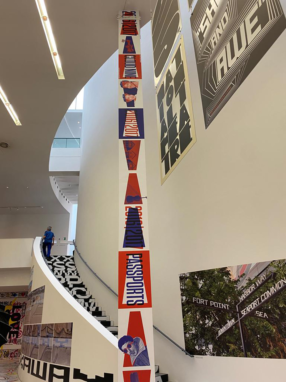
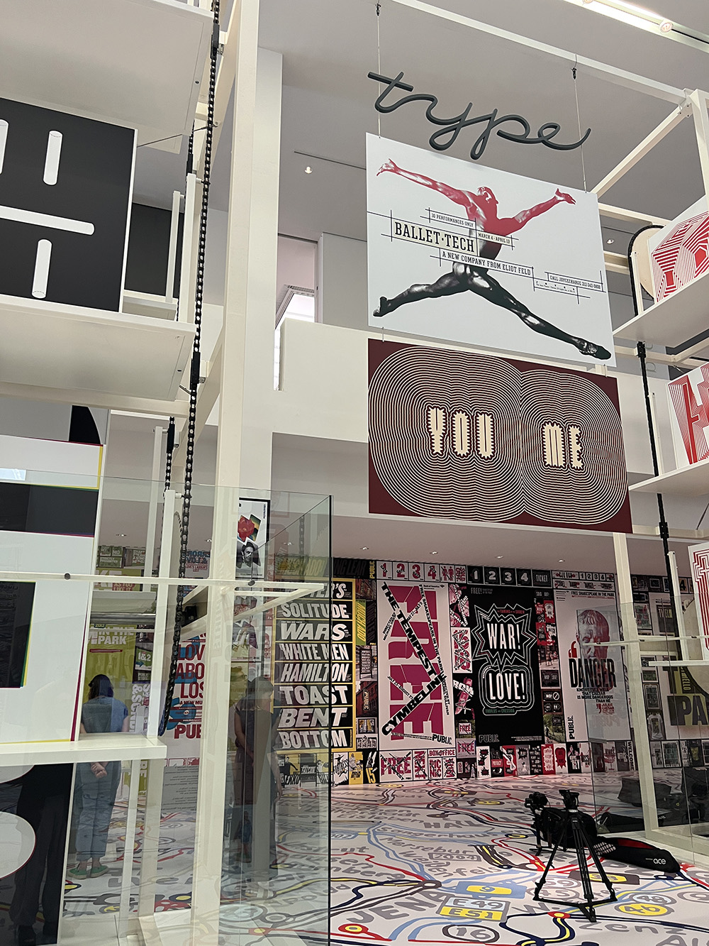
Here at the Pinakothek, full-scale posters are installed on walls, glued to columns, and hung from within a kinetic, floor-to ceiling mechanism where they rotate, slowly, for closer examination. Display cases (custom-designed by Scher with letterform-legs that spell the words “Sans”, “Serif”, and “Bold”) showcase album covers, editorial illustrations, and sketches that illuminate the designer’s process and, it bears saying, her unique sense of humor. (Her comical self-portraits are a particular delight.) Video screens reveal typographic animations at once revelatory and informative: meticulously produced, these visual deconstructions serve to both orient the viewer and to reinforce the underlying logic that fuels the work and frames its scope.
Scope, here, is key. From drawing to painting, letterform to logo, typographic animation to architectural adaptation to full-scale comprehensive intervention, Paula Scher’s work reminds us that design provides an infinite series of inflection points across the full range of public life: from the theatre to the street, the corporate sphere to the political circus. And here, if there is any downside to this magnificent installation, it is that its title—Type is Image—may not adequately reflect the ever-shifting parameters, and by conjecture, the ever-expanding manifestations of this work and its indefatigable maker. For Scher, type is image, but it is also language, and metaphor; system, and sentiment. It is the spine of an idea, and its lifeblood, its spirit, perhaps even its oxygen source. It is method and motive, constant and variable, a way to frame both a question and contextualize its many answers.
Finally, it’s worth noting that Scher’s own answers are verbal as well as visual, as befits someone whose love for fonts is legend. But the content of her work is just as impressive, reminding us that designers are in a unique position to author and adjudicate, to frame an idea’s context as much as its contours. There is perspective in this work, and intentionality; spirit alongside soul. Paula Scher’s work will restore your faith in many things, not least of which is the idea that the projects assembled here represent a mere fraction of one designer’s prodigious output, output made possible by her deeply human and infinitely creative mind. And on this score, anyone even remotely worrying about the existential threat of AI will thrill to this exhibition, as they should. (That Porsche—painted by hand, over the course of a year—says it all.) And why not? After all, Paula Scher is showing no signs of slowing down: so why should we? Time to get busy—and get to Munich—to see for yourselves.
Paula Scher’s first solo exhibition in Germany, “Paula Scher: Type is Image” opens this evening in Munich at Pinakothek der Moderne, in Munich, where it will be on view until fall, 2024.


Photos by Anette Lenz
Observed
View all
Observed
Share on Social
By Jessica Helfand
 Jessica Helfand, a founding editor of Design Observer, is an award-winning graphic designer and writer and a former contributing editor and columnist for Print, Communications Arts and Eye magazines. A member of the Alliance Graphique Internationale and a recent laureate of the Art Director’s Hall of Fame, Helfand received her B.A. and her M.F.A. from Yale University where she has taught since 1994.
Recent Posts
A quieter place: Sound designer Eddie Gandelman on composing a future that allows us to hear ourselves think It’s Not Easy Bein’ Green: ‘Wicked’ spells for struggle and solidarity Making Space: Jon M. Chu on Designing Your Own Path Runway modeler: Airport architect Sameedha Mahajan on sending ever-more people skyward