09.19.05
Rick Poynor | Essays

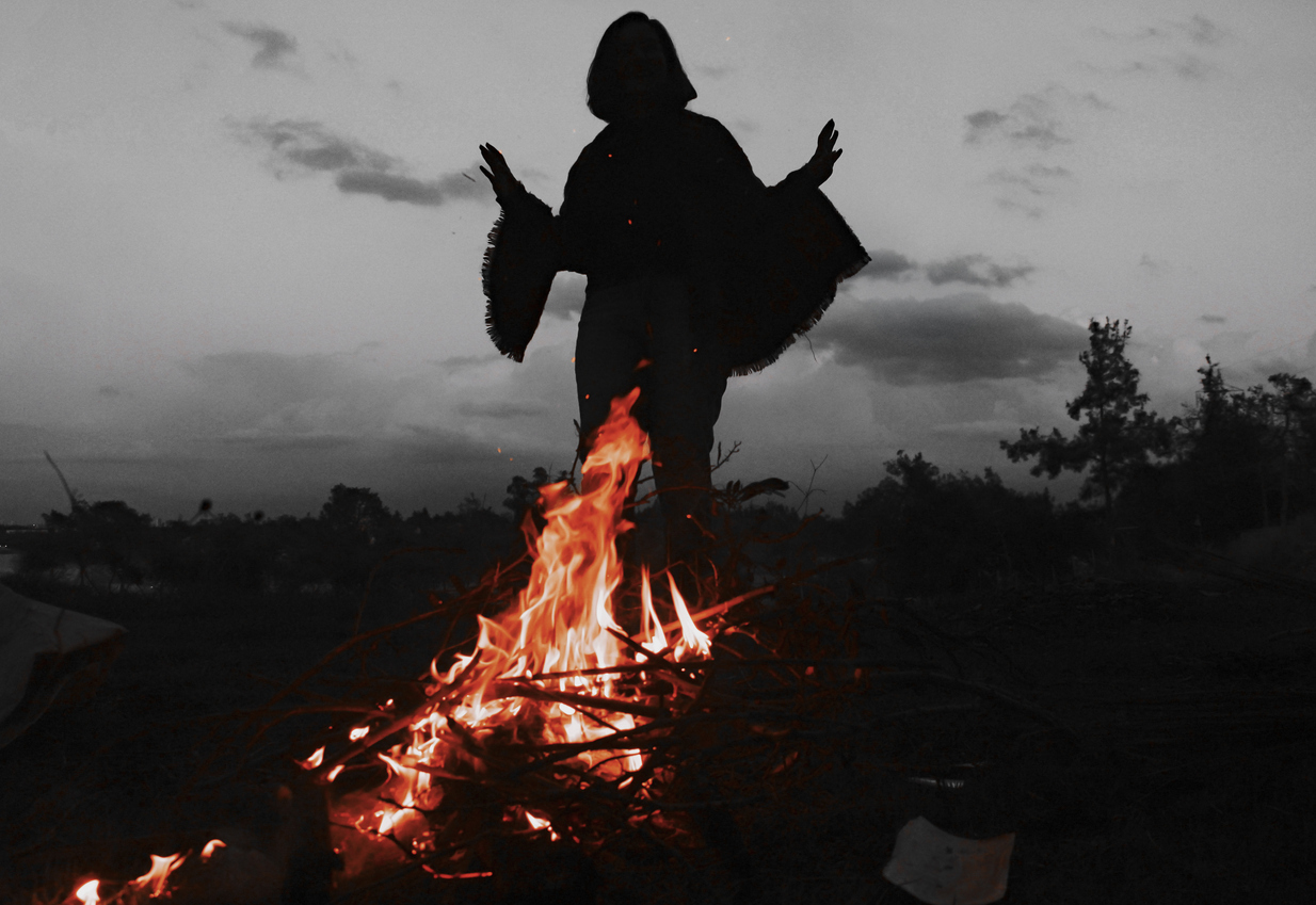
The Guardian’s New European Look


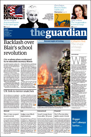
The Guardian, front page, 17 September 2005. Creative director: Mark Porter

There was an immediate flood of opinion when The Guardian's widely anticipated redesign appeared last Monday — much of it in the Editors' Blog on the paper's website. But it seemed best to consider at least a week's worth of papers before commenting. Even now, any assessment can only be provisional. It can take months before the full potential and strengths of a newspaper redesign become apparent. A paper is an instrument and its editors and designers have to learn how to play it to perfection.

There can be no better illustration than The Guardian's previous design. David Hillman's new look was a radical departure in 1988 and, at the time, many readers expressed dismay. Designers Simon Esterson and Mark Porter built on Hillman's kit of parts to create a classic design that expressed The Guardian's editorial essence not only in the main paper, but in every scrap of print it produced. The Guardian exuded authority while looking fresh, contemporary and approachable. Hillman's brilliant masthead, composed of "The" in Garamond italic and "Guardian" in Helvetica bold, was justly regarded as an icon. (Hillman has spoken out against the redesign.)

But the paper had no choice but to change. Its presses were old and would soon need replacing. In 2003, two broadsheet rivals, The Independent and The Times, changed to a tabloid format. Research has consistently shown that commuters prefer smaller papers which are easier to handle in confined spaces. The Independent has its admirers and has produced some memorable, campaigning front pages, but both papers look miscast in this attire, their traditional broadsheet typography ill at ease within a format better suited to fist-swinging tabloid journalism. Visually, they are shadows of themselves.

The Guardian's choice of the "Berliner" format, half-way between broadsheet and tabloid, is an inspired alternative. The paper is the first British title to adopt this European page size (315 x 470 mm), also used by Le Monde in France, the Neue Zürcher Zeitung in Switzerland and Repubblica in Italy. Elegant, well-proportioned pages make The Times and The Independent look like poor relations. These competitors must be seething at being trumped by a paper that has already succeeded in establishing itself as an international force. More than 10 million people a month around the world read The Guardian's digital edition, which is available free of charge until 26 September, allowing visitors to sample the new design. Since 9/11, The Guardian has joined the BBC as a major non-American news source for US readers and its letters pages often feature American correspondents.

The most controversial change is to the masthead. Guardian creative director Mark Porter commissioned British designer Paul Barnes and American designer Christian Schwartz to create a new typeface family, Guardian Egyptian. Any convincing redesign probably needs to go all the way, but the new lowercase masthead reversed out of a blue bar, though modern enough, is no match for Hillman's classic and I doubt it will prove as durable. The headlines lack impact compared with Hillman's Helvetica — a broadsheet innovation in its day — though they are certainly refined.

The main problem with the front page is the fold. This creates a visible surface smaller than a tabloid and, when turned sideways on a newsagent's shelf, it does little to attract attention. The unnecessarily large teasers and the masthead monopolise more than half of the visible area. Unfolded, the front page is attractive, but it remains to be seen whether the new five-column grid, which replaces an eight-column grid, has enough flexibility. In the first week, the paper used two picture placements twice on the front page — a slightly worrying sign. The row of news summaries at the bottom further reduces the space available to create striking lead stories. So far, the front pages have lacked the old Guardian's news focus and drama. They are trying to squeeze too much in.

Inside the main paper, the pages are clearly structured, with sharp headlines and good use of white space, and the different weights of Guardian Egyptian give plenty of typographic variety. News reports are justified; commentary and opinion ranged left. The pages may be smaller but there appears to be no reduction in words: the broader columns seem to hoover them up. The "Comment & Debate" section now fills three pages. Obituaries have expanded from one page to two and there was even space for a full-page appreciation of Henryk Tomaszewski by British image-maker Andrzej Klimowski, illustrated in colour, an unprecedented amount of coverage for a graphic designer.


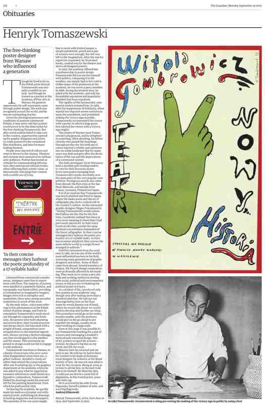
The Guardian, Obituaries, 19 September 2005. Creative director: Mark Porter

The Guardian is the first British paper able to print colour on every page. This is seen to most striking effect in the "Eyewitness" centrespread dominated by a single, huge, cinematic photograph — one showed artist Marc Quinn working on a sculpture of a disabled woman bound for Trafalgar Square in London, another plunged the viewer into a riot scene in Belfast. The quality of the colour was generally excellent, though there were sometimes registration problems. There was also a tendency to overuse the new resource. Do we really need to see colour pictures of so many Guardian writers? What does it add? Let's hope the paper remembers the power and subtlety of black and white once in a while.

I was less convinced by the daily feature supplement G2's new format. As a tabloid, it worked perfectly. Now stapled, it has shrunk to half the Berliner, making it more like a magazine, though it's still printed on newsprint. The fold is off-centre giving it a scrappy, unfinished look at odds with the design's refinement. One welcome piece of visual journalism is a weekly, two-page "G2 Graphic" by information designers Grundy & Northedge. Last week's focused on the arms trade and the latest topic was oil prices. The Guardian has excelled at this kind of thing, particularly in its special supplements on subjects such as surveillance and food, and it's to be hoped the paper does more. Another new G2 visual feature by art critic Jonathan Jones, analysing a photo in the news using superimposed captions, didn't quite come off, but this is certainly an idea with potential.

Other sections — Sport, Media, Education, Technology, Film and Music — are printed in the Berliner format. They work well enough but ironically they are less easy to handle than the previous tabloid versions, and because they are the same size as the main paper, they look less distinctive, too. One disappointment was the reformatting of the formerly tabloid-sized Saturday Review. Beautifully judged, this was one of the high points of the old design, a mark of the paper's creativity, confidence and panache, and a rousing blow against the dumbing down of contemporary cultural life. It gave dedicated literary papers such as The Times Literary Supplement and London Review of Books a run for their money and it was always a treat. The new Review is just ordinary, resembling any other weekend culture supplement, even if the writing remains as good as ever. Here again, the Berliner reveals its drawbacks, while the riot of sections — Family, Money, Work, Travel — announced by huge slab serif titles in supposedly enticing candy-wrapper colours makes you all the more appreciative of the main paper's restraint.


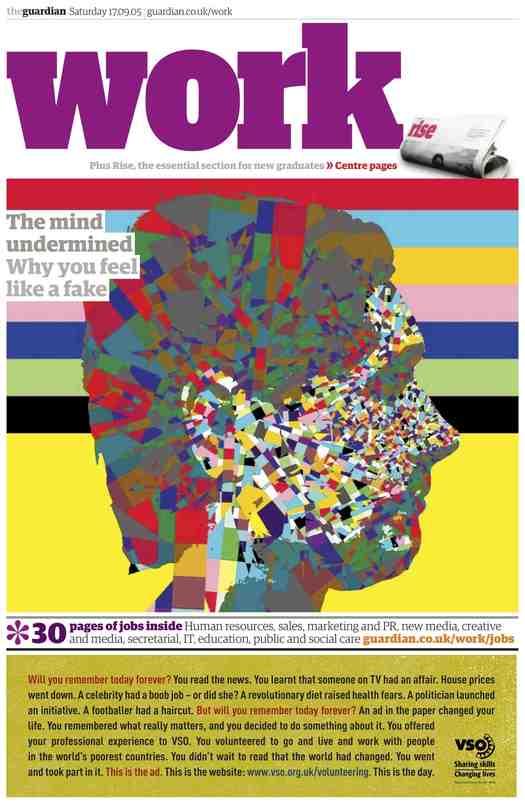
The Guardian, Work supplement, 17 September 2005. Creative director: Mark Porter

Despite some reservations, my reaction to the redesign is positive. The Guardian, owned by the Scott Trust, is one of the world's great newspapers, a true independent and a vital alternative voice at a time when too many papers are run by a handful of proprietors pushing their own political agenda. I rarely miss it and I can't wait to see if the paper can develop a presence that expresses its ethos as persuasively as the previous design. As the editors and designer point out, the Internet has changed printed newspapers for ever. Much of The Guardian's international success has come from the symbiotic link between paper and website. The next step will be to reflect the new identity online and Neville Brody, the site's original designer, is reported to be working on it. The Guardian's bold new format sets it apart from its rivals and any paper that wants to follow its example will need to find £80 million to buy new presses and fund the exercise. It will also need an uncommonly imaginative belief in the possibilities of design and that could be a lot harder to acquire.


Posted in: Business, Media, Typography


Comments [15]

I agree that the Berliner format is superb. No-more caressing suited elbows.

Also, the overall the new re-design looks very good - on screen. The colour of that eye-catching blue doesn't look at all vibrant/young enough on newsprint. The combination of the blue band with lighter blue 'the', and white 'guardian' seem - dare I say it - awkward, all squished in like that.

I sure I'm just having a petty grumble because I feel I ought to, being of the design caste an' all. Give it a year and I won't even remember the pre-Berliner format.
Shaun Morrison
09.19.05
01:50

The format change is a useful innovation; not so sure that changing a very iconic masthead is such a great idea. On a crowded newsstand, recognition is key; I would have preferred to see that gently updated, maybe with a new Jonathan Hoefler version of Garamond and a sans-serif that updates Helvetica with a characteristically British twist - drawing upon 19th century sans-serif grotesques, for instance. To me, egyptian faces are more characteristically French or, in their heavier weights, American; the Work section above looks rather Push Pin circa 1976.

I guess I'm spoiled - almost every newspaper around me was redone recently by Lucie Lacava, whose award-winning work always manages to keep the character of the newspaper and masthead intact, while updating its functional utility and readability in the age of super-accurate 4-colour presses.
aj
09.19.05
05:29

At a time when the newspapers are migrating to the web, and newspaper internet sites are offering more and different content than their hosts on a 24 hour cycle, newspapers are forced to change (or become shadows of the web experience). While at first glance the Guardian's typography is a bit jarring - especially the tombstoning on the front page - it is nonetheless a necessary move. The fact that the paper can accomodate run-of-the-press color is fantastic. Anyone working at newspapers understands how important color has become, and how frustrating it is not to get it when wanted. The full page obit for HT is just one startling example of how a story can benefit from unlimited color - and seemingly unlimited space. For no matter how strong or elegant the typography may be, space is the key issue. Without the option to be expansive with a story, a designer's hands are tied. And today, again competing with the web, the rule is to pack newspaper pages with a lot of news and feature.

The only downside to such grand display is that it might undermine the seriousness of the newspaper. News must be balanced against features, and the virtue and value of a newspaper has always been its immediate ability to cover various things at once. Too many features gives the impression of a magazine, not a newspaper. But maybe that it what's wanted during this transitionary period when so many younger people bypass the newspaper for the web.
Steven Heller
09.20.05
05:49

i think it's certainly the bravest piece of design i have seen for a long long time. To take such a respected design and trash it is liberating, shocking and upsetting. I agree about the masthead reservations, but conversely, if they had left the old logo, would we have been critising them for not having enough balls to scrap it. I dont know...

One thing is though, I cant stop buying it. For all my reservations (which roughly tally with Rick Poynors article), to see design used in such a powerful way has embibed me with a sense of optimism about design in general. If half-a-million-odd readers in the UK can get to grips with something,which in parts is really quite challenging (the coment section for example), then it is good news for graphic design. Having sheltered for years in the comforting embrace of inert design (of which helvetica was a major player) for such a pillar of the community business such as a newspaper to come along and in many ways say that actually engaging design is really important, that can only be a good thing.

Incidently, I thought Hillman sounded rather bitter and even a little hurt in the Indie article. For someone who I have held in such esteem, to level personal insults against a fellow designer is just not on. I guess he's hasnt had much work recently and needs to raise his profile, but he should have known better than to be used by the Indie as part of their predictable anti-guardian campaign. Shame on you!


Kate
09.20.05
06:07

I think going smaller with the Berliner is genius. I would much rather have more smaller pages, rather than less larger pages. It makes is so mush easy to use and handle. As far as the design, its fine.
Nathan Philpot
09.20.05
02:58

One inescapable truth is that, when redesigned, a daily publication quickly obliterates the memory of that which predeced it. I remember being shocked when the New York Times replaced all its headlines with a new drawing of Cheltenham two years ago. I was a fan of the previous style. But within a week, I could barely remember what it looked like. Encountering a pre-redesign issue a month later, it looked hopelessly out of date. Such is the power of daily repetition.

I wonder what Rick and others think a week later, now that the design must be establishing itself. Would you revise your original assessment?

Michael Bierut
09.21.05
07:36

Michael, I waited a week to write anything. By that time I'd seen seven days' worth, including this Monday's. Two days later my assessment hasn't changed but, as I said, it is largely positive. I particularly like the main paper. "Comment & Debate" is the part I usually turn to first and reading that section at lunch time today, the paper felt like it always has done, better actually because this section has increased in size.

I'm delighted that they didn't turn tabloid. I think those former broadsheets look cramped and uncomfortable, like a big person struggling inside a suit that's several sizes too small. The Guardian's pages, on the other hand, though reduced in size, still feel big and expansive when you are looking at a spread and the quality of the design obviously helps here.
Rick Poynor
09.21.05
09:28

Ten days down the line and the standard is still incredibly high - the closest a British paper gets to the New York Times with quality information graphics, news features and innovation.

Today's centre spread image for example, a shocking and moving piece of reportage photography of New Orleans 22 days after Katrina

As Rick says, the paper now has a distinguished european appearance. However, designers and readers alike saw the previous Hillman masthead as a stroke of genius - the new blue masthead has been coming in for criticism for looking like many european free commuter papers who all use blue panelled sans-serif logos. Also, on close inspection the kerning of the masthead is poor; strange given the attention to detail on the rest of the paper's typography.

The real test of the success or otherwise of the redesign will be the circulation figures...
Jon Hill
09.22.05
10:58


As a big fan of the previous design, I was wary of the new look. But, visiting my wife's family here in London for the next three weeks, I've been buying every issue since last Friday and have to say that I love the new look.

The size is perfect, and the format seems to allow for a tremendous amount of design flexibility -- something akin to what one might get in a magazine.

I also find myself reading the paper thoroughly, something I often never even accomplish when reading the NY Times. Have heard rumblings that American papers are looking to possibly adopt the format in larger numbers and I'm hoping they take a serious look at what's been accomplished here.

My only gripe, I suppose, is the use of Berliner for the logo -- it seems a bit lazy and uninspired. That said, it's otherwise brilliant.

Now if they'd only redesign the damn website -- while it carries all the material from the paper, it's a horrible design and pales in comparison to what you get in print. (As opposed to what the NY Times has been able to accomplish over the years with their website.)

I'll miss the paper when I head back to the States in October.

Anthony Baker
09.22.05
03:22

I agree, Anthony, the paper is extremely easy to read and I've had a lot of non-trainspotter friends saying that too, unprompted. It seems as though Mark Porter et al have succeeded to tick all of those redesign cliches; entry points, levels of navigation, ease of reader feedback etc without making a piecemeal, unsatisfying product.

As for the site, as Rick mentioned, there is a strong rumour in the UK that Brody has been invited back to refresh the site but not mimic the paper. The plan is to revolutionise the website in the same way they have the daily and I just hope they spend the same amount of time getting it right. I am very much looking forward to what the new face of news websites will be like.
Jon Hill
09.23.05
03:44

Having spent the weekend in London and having been exposed to the new design for a few days in a row, I am quite impressed by the new design. Every detail in every section has been carefully considered, and it has the most thoughtful use of color I've ever seen in a newspaper.

That said, I found all this good design a little...exhausting. So many beautifully nuanced type treatments. So many carefully calibrated cmyk builds in so many lively, well-balanced headlines. So much design. It reminded me a bit of another extraordinarily ambitious feat of publication design, Luke Hayman and Chris Dixon's new format for New York magazine, which has been criticized for being "too much work" by some readers. (Too many departments, too many charts, too many sidebars, etc., all, by the way, designed with the elegance and precision of a Swiss watch.)

In the case of the Guardian, there is the added question (which Steve Heller alluded to above) as to whether the design approach is better suited to supporting analytic feature writing (a strong suit of the Guardian) rather than hard news reporting. How beautiful can hard news be made to look before it loses credibility?
Michael Bierut
09.25.05
04:37

I agree with the previous comments stressing a new "european taste" in the redesign. As a Continental, I like my British newspapers to look distinctively British, so I'm a bit disappointed here.
I usually love Christian Schwartz's work, but I think the typeface design here, though fonctionally and aesthetically remarkable, is culturally ill-advised : in its lighter weights, it has a strong Dutch feel — these flattened arches on lowercase n's remind me of many Gerard Unger's creations, for instance, and in the heavier versions, the angularity is reminiscent of Swift, etc.
Therefore, I find the titles a bit bland : since they are set in a light face, they make a very "grey" page compared to the strong visual accents provided by the old Helvetica Black.
Stéphane Darricau
09.25.05
04:07

It's funny that you found the Guardian too beautiful Michael. Robert Thomson, editor of The Times in London, said "The paper has yet to resolve the contradiction between aspiring to be an installation in the Design Museum and a success on the newsstand".

Alan Rusbridger, editor of the Guardian has responded: "Younger people in particular are so used to everything in the world being well designed - why shouldn't their newspapers be? Old newspaper critics use 'design' as a term of abuse. They say the paper is too beautiful. I can't think of any other walk of life where that would be a criticism."

But I think I know where you are coming from. A newspaper needs to have an urgency about it and the more mannered or considered a front page is, the less 'newsy' it seems. But isn't this now true of the medium? A reasonable sub with a decent template and set of style sheets can put together a slick looking page in minutes. We all know that albeit a feat of cutting edge printing technology and distribution, the Guardian, like every other newspaper, is no longer urgent.

Mark Porter, the Guardian's art director said of the new design that "if everyone else around you is shouting then perhaps you need to speak in a normal tone of voice, or even whisper" (I think I first read that statement in a Bruno Monguzzi book, but that's another post altogether). It's certainly true that right now the British press is shouting very loud; supermodel's in drugs scandals etc etc. It's no accident the Guardian's typography has the elegance and clarity of a book.
Jon Hill
09.26.05
04:39

I had a chance to spend time with the Times, the Observer, and the Independent as well. The level of design across the board is superior to what we have here in the US. The Guardian is far and away the best.

I agree with Mark Porter that "too beautiful" is a peculiar criticism. I was amazed on close examination how good the printing is, with registration accurate enough to permit color in some of the lightest weight headlines. Perhaps my idea of what "urgent journalism" is meant to look like was formed by the limitations of printing technologies that are now outmoded. It will be interesting to see how the standard (as opposed to The Standard) gets reestablished by newspapers like the Guardian.
Michael Bierut
09.26.05
05:32

Spending time with The Guardian was one of my favorite times of the day when I lived in London. So, if I find it at a newsstand carrying foreign papers here in Laguna Beach, I'll certainly buy a copy to peruse. Another one that could follow the trend is the Financial Times. Color has already crept onto its peachy pink pages. At their website they've got their 'signature paper' in a box around the uppercase ef and tee. I wonder if it's because the pastel 'salmon' was too bright as an all-over background on screen.
Shahla
09.26.05
06:14


Jobs | March 28