
Business • Graphic Design • History • Media

November 12, 2012
Making WET: The Magazine of Gourmet Bathing
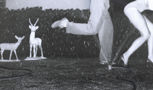
Photo for the front/back cover of the November-December 1977 issue of WET
Editor’s Note: WET: The Magazine of Gourmet Bathing was first published in 1976 by Leonard Koren. Thirty-four influential issues were published before the magazine closed in 1981. The following is an excerpt from a new memoir: Making WET: The Magazine of Gourmet Bathing by Leonard Koren; from Imperfect Publishing (2012), printed with permission of the author.
People often assume that I’ve always been interested in bathing. But this isn’t so. My fascination really only began while in architecture school. Like most of my classmates, I was initially drawn to the heroic architectures du jour, Modern — the taut, muscular variety — and then proto-Postmodern. When those love affairs soured, I became curious about less self-conscious, more humane approaches to place-making. This led me to small, intimate environments: the kinds of places you go to feel safe and secure, the kinds of places that induce you to “let go” and “be yourself.” The Japanese tea room — despite its very appealing form and philosophy — was too culturally specific for the vague purposes I had in mind. I sought a species of enclosed space that offered similar possibilities for transcendental experience but was more universally available.
That’s when I discovered the bathroom. Bathrooms are everywhere. Just about everyone has one. And every bathroom, no matter how crude or sophisticated, comes equipped with all the elements of a primal poetry:
Water and/or steam.
Hot, cold, and in between.
Nakedness.
Quietude.
Illumination.
 During my last year of architectural study, I lived in Venice (California) in what had originally been a gondola garage. Venice, like its Italian namesake, was once crisscrossed by canals. When the waterways were filled in and paved over, this sprawling structure was converted into an automotive repair shop. Eventually that business folded and the complex was purchased by a trio of artists who divided it into three live-work spaces and an apartment, where my girlfriend and I resided.
One of the artists, Peter Alexander, had a trench-like depression in a section of his floor. It was a long, narrow grease pit that had once enabled mechanics to work underneath cars and trucks without having to jack them up. Peter painted this concrete void white, then filled it with water; the water was recirculated through a swimming pool filter and heater. A skylight was installed overhead with small prisms positioned along its sides. On sunny days rainbows washed across the trench and its shimmering surface.
In an adjacent studio, artist Jim Ganzer chipped away at his concrete floor until he reached the dirt underneath. Over a period of years he reclaimed a twenty-five-foot circle of earth into which he placed tropical plants and banana trees. Gravel and rocks, big and small, were scattered in the spaces between. Then Jim punched holes in the roof to let natural light in and the trees grow out. He installed shower heads high up near the ceiling. Whenever Jim wanted to water his garden he simply took a shower.
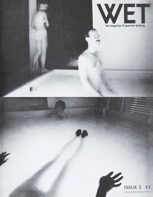
WET issue #3.
By the time I had completed all the coursework for my master’s degree, architecture was the last thing on my mind. I was off in a different direction. I was making bath art. This involved getting people to take off all their clothes and then bathe, according to my detailed instructions — in either water, mud, hot air, or steam — while I took photographs. Afterward I assembled the images into more complex visual artifacts, usually lithographic and silkscreen prints. I sold these in galleries and through word of mouth.
The models for my various projects were mainly artists, and all of them had modeled for free. I wanted to reciprocate for their kindness and generosity, but I had little money. A “thank you” party felt like a good solution. A friend suggested I check out the Pico-Burnside Baths, a down-at-the-heels Russian-Jewish bathhouse midway between downtown Los Angeles and the beach. Once inside I was immediately charmed by the authentic retro ambience, down to the mismatched wall finishes and the lingering smells of Eastern European delicatessen foods.
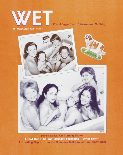
March-April 1978 issue of WET
The manager quickly let me know that mixed-sex bathing was absolutely forbidden. But what the hell. He offered me the entire facility — a sauna, two steam rooms, a swimming pool, a whirlpool, snack and changing areas, and a weight training space — for $450, provided I cleared everyone out by midnight. I calculated I would need an additional $200 for refreshments; I had friends who could cater at cost. And I knew an electric jazz violinist who might play if I offered him $100 or so. It was well over my budget, but since the place could accommodate at least 150 people, and I was obliged to comp only about 70, I figured I could invite other art-related types, charge them for an unusual experience, and cover all my costs.
The party came at the end of an exceptionally sultry late-summer day. Angelinos, tan and tight after the discipline of three months in a bathing suit, were unusually primed for something new and edgy. And that’s what they got. The next morning the buzz around the art and design communities was “You should have been there!” Then the Los Angeles Times ran a long, gushy feature on the event. Included was a photo of me shaking hands with fashion designer Rudi Gernreich, the creator of the monokini, a.k.a. the topless bathing suit. Gernreich was elegantly attired in shoes, slacks, and a sweater. I was barefoot, a flimsy yukata clinging to my torso. This ramped up the hyperbole and myth-making to an extraordinary level. By the end of the week even I was deluded into thinking that a new (arty) context for pleasurable social interactions had inadvertently emerged. Conventional norms of party behavior appeared to have been upended, or at least temporarily suspended. Things were definitely going my way.
How, I wondered, could I exploit this unexpected turn of events?
My brain was on overdrive. In order to slow things down I would draw a hot, steamy bath around two or three o’clock every afternoon. Once immersed I lay perfectly still. My muscles unclenched and my eyes softly focused on a patch of mysteriously glowing water six inches in front of my nose. During one of these quiet moments an almost-audible voice whispered into my ear, “Why not start a magazine about gourmet bathing?”
May-June 1978 issue of WET
A magazine about gourmet bathing? Why not? It seemed to make a lot of sense. If nothing else it would solve the problem of what to do next. What is “gourmet bathing”? I didn’t really know. And I didn’t really care. I supposed it could mean a multitude of things. That was good.
Though I had no skills in writing, editing, designing, art direction, advertising sales, publishing, or business generally, I didn’t consider this an impediment. I would learn as I went along. Besides, I had a lifetime of opinions about what made magazines irresistible. For instance, I loved the emphatic dogmatism of Vogue. “This season it’s RED!” “Baggy is OUT!” ”GRAY is the new BLACK!” Of course, it was sheer bluster. But it perfectly exemplified a certain manufactured hauteur that was vital to making the “magazine-reality” illusion work, at least in the realm of fashion.
I also liked Andy Warhol’s Interview. It was chock-full of vacuous interviews with self-infatuated minor celebrities. It was drivel, but it was magnificently framed — and very well designed — drivel. And then there was Gourmet. Its writers and photographers roamed the world bringing its readers words and pictures describing heavenly quiches, wondrous sauces, and sublime cuts of meat. How utterly pretentious and yet, how fantastic!
September-October 1978 issue of WET
I had few fixed ideas about my embryonic magazine’s form or content. I didn’t even have a name. So I began asking friends and acquaintances, “What would you name a magazine about gourmet bathing?” Typically there was a chuckle or two followed by, “What do you mean by ‘gourmet bathing’?”
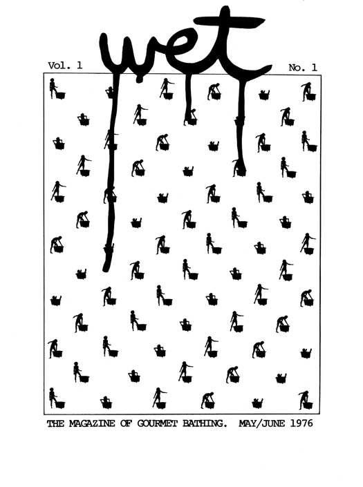
My impromptu explanations began to define the contours of a plausible editorial universe. “Water,” “damp,” “H2O,” “clean,” “soak” and “dribble” were some of the titles suggested. Loren-Paul Caplin, a poet-composer-playwright — who improbably supported himself as a real estate developer — proffered “wet.” While not perfect, “wet” felt good enough. It was a short, no-frills word amenable to all kinds of typographic treatment. It also had some nifty connotations: water-related, eccentric, off-the-wall, sexually aroused. . . . These meanings, I mused, would let the magazine evolve in any number of ways. I went so far as to imagine “wet” as one of those core English-language terms, like “life,” “time,” or “look,” that succinctly encapsulate an entire worldview, an essential way of being.
I solicited images and text for the first issue from friends and acquaintances who were happy to participate in my new adventure. Advertising came mainly from the same pool of people. Ad income ended up exceeding printing costs, so WET issue number one actually made a profit.
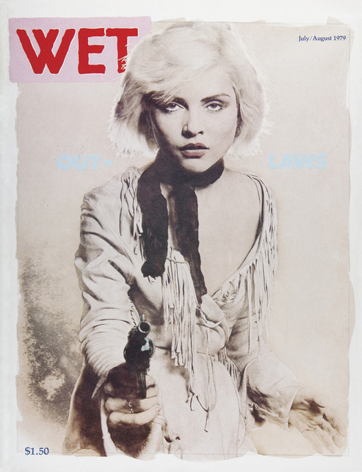
July-August 1979 issue of WET
For the first year the magazine was printed at Peace Press, a politically left-leaning collective in Culver City. Someone there had quoted me the lowest price, in the friendliest manner, of the half-dozen printers I had contacted over the phone. One of the employee-owners set me up on a back-lit glass table with a knife, transparent tape, and a T-square. She also gave me advice on how to get my unruly materials into prepress order. A few days later I returned to Culver City to watch the press in operation. The following day I came back and picked up six hundred folded and collated copies of my magazine.
WET issue number one actually looked an awful lot like a newsletter, but I was ecstatic nonetheless. I rode my bicycle around Venice and shoved copies into the mail slots of everyone I knew. The response was generally appreciative, but there were also instances of acute mystification. “Why would anyone possibly want to make a magazine about g-o-u-r-m-e-t bathing?”
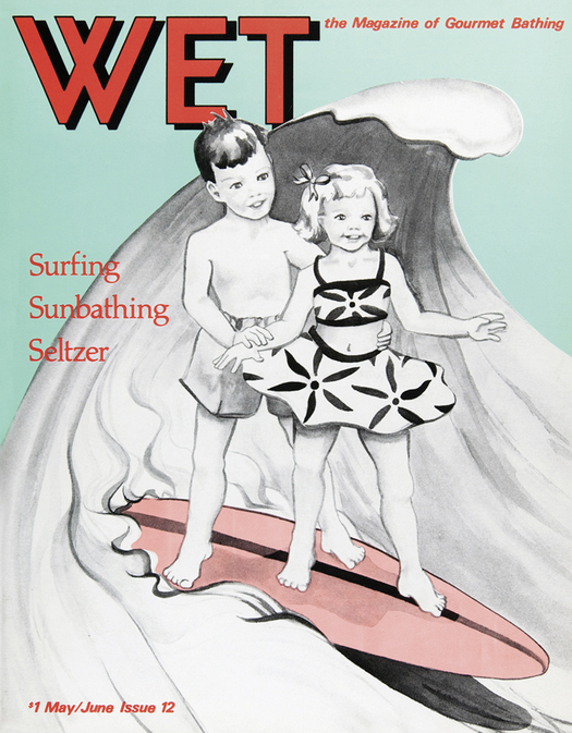
On balance, there was enough encouragement to fuel my confidence for a second issue. This time the publishing routine was the same except now there were more pages, and thicker, denser paper. There were also more expenses, so I charged more for advertising to compensate. By issue three, still working under the influence of kind words and peer support, I was on the verge of producing a “real” magazine: a hefty thirty-six pages, on coated stock, with an appealing cover image.
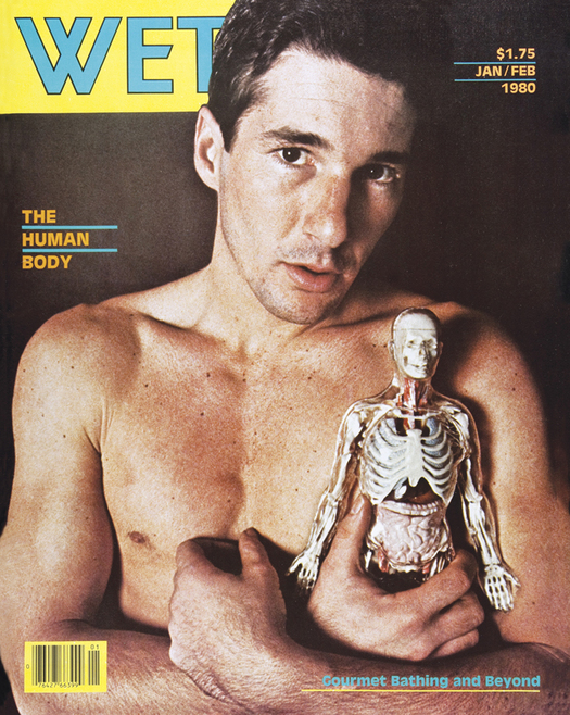
January-February 1980 issue of WET
All the graphic conventions of the first two WET issues were developed ad hoc, that is, they were improvised on the spot for each design problem that needed solving. By issue three I finally understood the many practical advantages of at least having a consistent and readily identifiable logo. My sole reference for font styles was a complimentary Letraset rub-on lettering catalog that I had grabbed off the counter of an art supply store. There were about thirty typefaces to choose from. I cut out the letters W, E, and T, in every font that met some instinctive criteria, then I pasted down “wet,” “Wet,” and “WET” in each of them.
I liked the rendition in the all-uppercase Kabel font best. Then I tweaked it a little. The W, fashioned out of two overlapping Vs, had a defiant energy similar to a swastika — but without the horrible associations. The E was frisky. The middle tine was cut off at a 45-degree angle; it felt sexy in a reductive sort of way. (I thought it was the typographic equivalent of a sly erection.) The T possessed a magnificent solidity. Together, all three characters conveyed a distinctive Teutonic strength, toughness, and linearity — the exact opposite of the soft, fluid suggestions of “wet.” I liked this contradiction: literal meaning versus its graphic representation. This editorial dynamic was beginning to play out on the pages of the magazine as well.
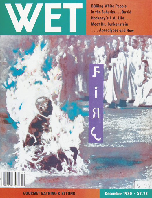
December 1980 issue of WET
I also wanted to replace the off-the-platen typewriter typeface I had been using for the text with something more stylistically flexible, and less time consuming to generate. (Do-it-yourself computer typesetting was way off in the future.) In all of my previous bath-art projects I had limited myself to the plainest and most generic-looking fonts, an artworld convention I had picked up somewhere along the way. The implicit rationale was that artists should concern themselves with the larger chunks of artistic construction and not waste time with niggling minutiae like type styles. In architecture school I had also acquired the prejudice that interior designers merely decorate, they don’t actually create. Graphic design, following this tenuous line of reasoning, is the two-dimensional equivalent of interior decorating.
But now, elements like font style, line and character spacing, etc., no longer seemed like inconsequential details. They were the means, the constituents of a graphic grammar and connective tissue, necessary for establishing visual relationships between words and pictures. Much of a magazine’s synergistic dynamism, I realized, was precisely due to the kind of page “decoration” I had once eschewed. If I had more command over this graphic language, I could make a better magazine. If I could find someone to give me a crash course in graphic design or, better still, advise and/or commandeer some of those functions, WET would greatly benefit. I put my feelers out.
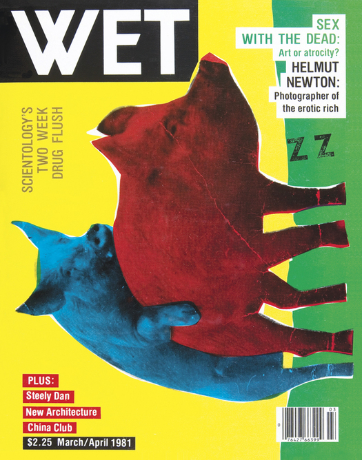
March-April 1981 issue of WET
Around this time, when WET issue number four was at the printer, I attended a raucous Venice party at the cottage of David Ross, a museum curator. In the midst of all the tumult, David was discoursing on the difference between “good boring” and “bad boring” in video art. Then Thomas Ingalls walked by, and David introduced us. Tom had pale white skin, a long straight nose, and limp blond hair parted rakishly on the side. He was exactly how I imagined a graphic designer might look. His demeanor was jaunty and he wore a stylish, understated Italian sports coat and slacks; early Armani. We chatted and something clicked. He said he’d seen WET and admired its raw vitality, its “break them rules” spirit. I explained my need for graphic design expertise. He invited me to come by his studio.
Tom lived and worked twenty smog-choked miles across town in the Chapman Park Studio Building, a complex of live-work spaces built specifically for artists and photographers in the 1920s. Tom’s unit was fashionably appointed: iconic Italian lighting fixtures interspersed with Frank Gehry’s early experiments in corrugated-cardboard tables and chairs. In the vaulted-ceiling studio area, all the tools of the graphic design trade were logically arranged and set out. There was even a typositor, a machine used in the pre–personal computer age to generate headline type in virtually any size or font style. Attached to the walls were framed examples of Tom’s work. I was impressed and said so. In response, Tom offered the use of his studio to paste up — design and assemble for the printer — the next issue of WET. This arrangement extended also to the issue after, and the issue after — for well over half a year.
Tom was a good graphic design teacher. I also benefited from his advice on art direction. Up until then I had felt obliged to print in WET any photograph or illustration produced at my request. I had a sense of commitment to those who had expended time and energy for my benefit, and for free. (All art and editorial contributions to the magazine, for its duration, were without financial compensation.) As I endeavored to upgrade the magazine’s visual quality, however, I found this self-imposed moral responsibility onerous. Then Tom put it to me bluntly: “If you want to make the best magazine, you have to use only the best work — hurt feelings notwithstanding.” I followed Tom’s counsel and WET improved. (But I began making enemies.)
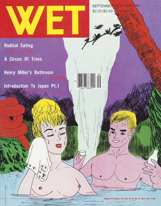
September-October 1981 issue of WET
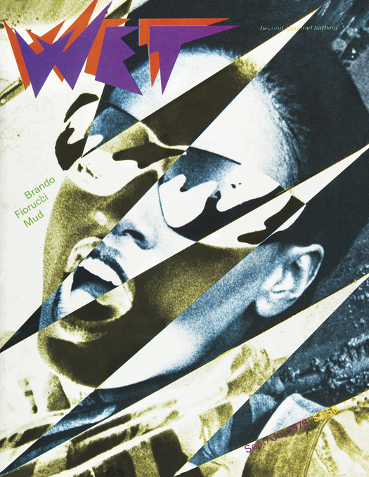
Tom also introduced me to his network of photographer, illustrator, and designer friends and associates. Most of them worked for conventional, run-of-the-mill publications and corporations: controlled circulation magazines, industry journals, and the like. In WET they were able to express their bolder, brasher, weirder visions — unfettered. April Greiman was one of these creators. She and Tom were romantically involved but on the verge of breaking up. In calmer times they had both agreed to assemble WET issue number six. It was to be the first time someone other than me designed the magazine. When I brought in the text and visuals, April and Tom were screaming at each other. Nervously I sat around waiting, wondering if I had made the right decision. During a lull in the fighting, I diffidently set out the issue’s design parameters. Then I left for San Francisco and hoped that their relationship would last at least another week, until I returned.
April, it turned out, was in the process of liberating herself not only from Tom but also from her dogmatic, Swiss design education. She, along with a handful of other creators across the country, was defecting from a graphic approach based on the venerable grid — the invisible underlying structure graphic designers used to align page layouts. I thought of April’s manic-cool, off-kilter floating punctuation marks and squiggles as “deconstructed Alpine Swell meets Juan Miró.” The look didn’t have a name then. A year or two later, when the nascent experimentation had jelled into a recognizable style, designers began referring to it as New Wave, and then, a few years later, Postmodern.
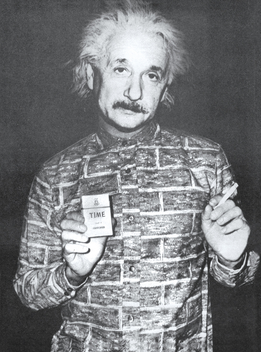
From the WET article “The Metaphysics of Cigarette Smoking”, November-December 1979 issue.
Observed
View all
Observed
Share on Social
By Leonard Koren
 Leonard Koren, who trained as an artist and architect, founded and published WET: The Magazine of Gourmet Bathing, one of the seminal publications of the 1970s. Koren’s previous books include Wabi-Sabi: for Artists, Designers, Poets & Philosophers and Undesigning the Bath.
Related Posts

Sustainability
Delaney Rebernik|Books
Head in the boughs: ‘Designed Forests’ author Dan Handel on the interspecies influences that shape our thickety relationship with nature

Design Juice
L’Oreal Thompson Payton|Books
Less is liberation: Christine Platt talks Afrominimalism and designing a spacious life

The Observatory
Ellen McGirt|Books
Parable of the Redesigner

Books
Jennifer White-Johnson|Books
Amplifying Accessibility and Abolishing Ableism: Designing to Embolden Black Disability Visual Culture
Recent Posts
“Dear mother, I made us a seat”: a Mother’s Day tribute to the women of Iran A quieter place: Sound designer Eddie Gandelman on composing a future that allows us to hear ourselves think It’s Not Easy Bein’ Green: ‘Wicked’ spells for struggle and solidarity Making Space: Jon M. Chu on Designing Your Own PathRelated Posts
Sustainability
Delaney Rebernik|Books
Head in the boughs: ‘Designed Forests’ author Dan Handel on the interspecies influences that shape our thickety relationship with nature
Design Juice
L’Oreal Thompson Payton|Books
Less is liberation: Christine Platt talks Afrominimalism and designing a spacious life
The Observatory
Ellen McGirt|Books
Parable of the Redesigner
Books
Jennifer White-Johnson|Books