When reading was more fundamental than tweeting,
Time Life Books played a significant role in getting the general public to acquire books on almost every subject, from the histories of World War I and II, to chronicles of America’s infamous criminals and the Wild Wild West, to the nuts and bolts of home improvement and auto repair. These serial volumes were published every month or two, and available through mail subscription, although some were also on sale in certain supermarkets — imagine that. Most were beautifully art directed, designed, and printed and various new series were advertised on TV and in magazines and were highly anticipated by young and old.Â
In 1962 Time launched a new series that was, however, fairly novel even for them, a “soft-cover book club” called the Time Reading Program (TRP) edited by Time magazine’s chief book review editor Max Gissen and art directed by Edward A. Hamilton. The books were published through 1966 (briefly relaunched in the 80s) and ultimately included around 100 different fiction and non-fiction titles by vintage and contemporary authors. The thematic range was truly ambitious, but the illustrated covers were incredibly ground-breaking. Created by some of the most acclaimed artists, illustrators, and designers of the era — many experimenting with expressionistic forms prefiguring later editorial conceptual illustration — the covers had a huge influence on trade paperback design. Yet the TRP is all but forgotten today, ironically, even by some who created the covers. It wasn’t until recently, when Art Chantry found an almost pristine cache of them at a second hand bookstore, that I learned of their existence.
When Time Life began the TRP trade paperback, publishing was still in its infancy. Mass market “pocketbooks” or “rack books” dominated popular taste, while so-called trade books were high-brow yet low-priced for an academic audience. Better paper, sturdier binding and finer printing distinguished trade from mass (they were also slightly larger), but more important were the cover aesthetics. Mass market was known for its detailed romantic realism (usually with a nod to the prurient), while trade, which catered to the intellectual reader, was more abstract — more modern. Many American Modernist graphic designers, like
Paul Rand,
Leo Lionni,
Alvin Lustig,
Ben Shahn,
Ivan Chermayeff and Tom Geismar,
Rudy DeHarak, and others, helped develop a trade paperback graphic vocabulary based on stark graphic forms suggesting abstract expressionism wed to Bauhaus rationalism and minimalist typography. Today these early trade paperbacks and their mini-poster covers, which were decidedly less hamstrung by overbearing marketing departments, are prime examples of applied Modernism.
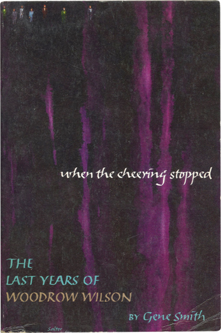
When the Cheering Stoppedby Gene Smith, illustrated by Salter
TRP was not the only book club to serve up a diet of good, nutritious books. The venerable
Book of the Month Club, founded in 1926, was the most successful to this day (although now the offerings are primarily pot-boilers and other page-turner bestsellers). A precursor to club idea was Albert Boni’s Thirty Great Books program, which offered 30 reprints for $2.98. Also in the mid-twenties clubs catered to devoted book enthusiasts, like George Macy’s Limited Editions Club and the Heritage Book Club, which reprinted classic works in smartly illustrated and expertly printed, slip-cased editions. Similarly the TRP was created to encourage reading and, more to the point, help the avid reader expand their literary knowledge and taste. Through smart cover and interior design and typography, a subtext of TRP was to raise the level of the paperback to a higher plane. Yet at same time, TRP also aimed to save Western culture from its inevitable slide into the abyss caused by television.
Even before publishing its first volume TRP attracted 80,000 subscribers based on the promise that three or four books would picked by the editors “for their contemporary relevance, their readability and their quality.” Another attribute of the series were new forewords written by scholars, biographers and experts of the reprinted authors or their themes. While design was not an overt selling point, it definitely contributed to the subscriber’s pride of purchase. A staff of three to four interior designers made certain that each book was typographically pristine (unlike the tightly leaded, small text type of mass markets). Edward A. Hamilton, who was also the author in 1970 of
Graphic Design for the Computer Age, a prescient book, assigned the covers. According to one of the illustrators,
Seymour Chwast, there was never any heavy-handed art direction. “I used three different techniques for each of the three covers I did for Ed Hamilton. As far as I can recall he didn’t direct the idea or the style. One was done with colored pencils on chip board, another was a woodcut and the third was painted, each appropriate for the books and the content of my design.” Actually Chwast did four covers (how soon they forget), and his 1962 cover for Loren Eiseley’s
The Immense Journey was so unlike Chwast’s typical approaches back then it might be mistaken for an
Andre Francois (who also did at least one cover).
The artists were in many cases a who’s who of the day, but just as many are just who? Among covers by
Austin Briggs (
Murder For Profit by William Bolitho),
Ronald Searle (
Three Men in a Boat by Jerome K. Jerome),
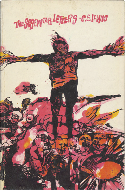
Jacob Landau (
The Screwtape Letters by C.S. Lewis),
Leo and Diane Dillon (
The Member of the Wedding by Carson McCullers),
Jacqui Morgan (
Wickford Point by John P. Marquand), Paul Hogarth (
The Horse’s Mouth by Joyce Cary), Norman Green (
Three Who Made a Revolution by Betram D. Wolfe),
Alexey Brodovitch (
The Doctor and The Devils by Dylan Thomas), and many more, there were names like Jerome Martin, Burt Groedel, Attilio Salemme, and Louis di Valentine who have disappeared from the history of design and illustration.

The Doctor and The Devilsby Dylan Thomas, illustrated by Alexey Brodovitch
Hamilton was eclectic, seemingly allowing the books to kind of choose their own artists, and then enabling the artists to follow the appropriate style or mannerism. Nonetheless, the emphasis is on expressionistic linear work either in pencil, crayon, watercolor or woodcut (with some collage thrown in). Cliff Condak’s cover for
Attending Marvels: A Patagonian Journal by George Gaylord Simpson, is an abstracted collection of lizard/dragons with a decidedly children’s book flavor. Ed Young’s cover for
Eastern Approaches by Fitzroy Maclean is reminiscent of the Rothko-esque paint fields that Paul Rand used on his covers for Wittenborn’s
Documents of Modern Art series. And
Lawrence Ratzkin’s cover for
In Flanders Fields by Leon Wolff has the eerie quality of the Fauvist George Rouault’s antiwar
Misere series.
It is unclear why TRP did not have an overall series graphic identity given the policy of Time Life Books to have such decisive brand-formats. Apparently since these books were not aimed at retail no overarching rules were necessary. Eclecticism was a viable and intelligent decision. While consistent design for a series of related books makes good strategic sense, these books were bound together by the editors’ judgment. Designing them as separate entities — avoiding the impression of formulaic repetition — made the most sense for the book club but also for the artists and designers who created them. Each cover (indeed each book) had a unique integrity that raised the standard of the genre while showcasing the creators’ artistic strengths.
Do I have a favorite? There is something about Ray Bailey’s 1964 cover for The Bridge Over the River Kwai by Pierre Boulle that is so hauntingly beautiful I cannot stop looking at and holding it. This is the perfect space for Bailey’s expressionistic interpretation of the storied bridge — any larger and it would be kitsch — the cover size is just perfect. And that’s the case with almost all these forgotten paperbacks, the size was perfect for the art and the art perfect for the size. Â

 Steven Heller is the co-chair (with Lita Talarico) of the School of Visual Arts MFA Design / Designer as Author + Entrepreneur program and the SVA Masters Workshop in Rome. He writes the Visuals column for the New York Times Book Review, a weekly column for The Atlantic online and The Daily Heller.