Graphics World magazine, November/December 1988. Typographic image by Phil Baines
This week I was reminded again of the British design educator Paul Stiff, who died in February, by the arrival of a collection of design essays that has just been published in Poland. It contains an article originally titled “Stop Sitting Around and Start Reading,” which Stiff wrote for Eye magazine in 1993. I can’t remember for certain whether he proposed this to me as editor, or whether I pressed him to write it. It was probably a bit of both, though, because I had made previous attempts to persuade him to contribute without getting anywhere, before finally cracking it.
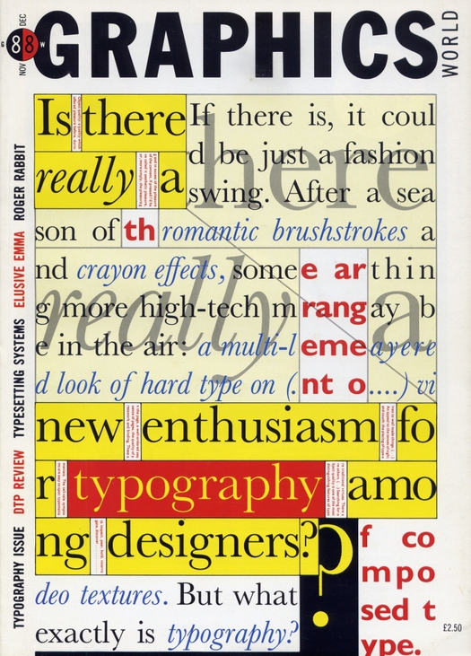
I’ll come back to that essay in a moment, but one thing leads to another and the Polish book prompted me to go looking for an issue of Graphics World published in 1988 — the image above — that I was pretty sure I still had somewhere. The magazine contains a six-page article, said to be Stiff’s first, titled “Design for Reading.” It’s really three articles in one: a main text defending the vital importance of readability; a secondary text setting out principles derived from his own experiences of “object quality” as a reader; and a slide show of examples with opinionated captions. Here, Stiff describes the hapless designers of an architecture book as “fiddling and blipping away” at the design “just to maintain their own interest in the job.” Even this brief quotation gives a flavor of the article (and the teacher): absolutely set against any designer shenanigans that might interfere with the reading experience.
One can only imagine what Stiff must have thought of the typographic cover image by Phil Baines — then an up-and-coming experimental typographer and now a professor at Central Saint Martins. Baines takes Stiff’s first paragraph and scrambles (or should that be blips?) it to form a typographic conundrum that can be read, but only with some effort. It’s a strong cover that probably worked well to attract a younger generation of readers then becoming increasingly interested in the expressive, textural and connotative possibilities of type. It was also, in 1988, a sign of things to come, when designers would seize the typographic possibilities of digital technology and concoct new justifications for their experiments.
Five years later, “Stop Sitting Around and Start Reading” was a rigorously argued riposte to what Sharon Poggenpohl of Visible Language had called a “more responsive typography.” Lucid, argumentative and engagingly readable, Stiff insists that designers ground their ideas and theories about reading in evidence:
Sceptics might ask: of all the sources of knowledge about reading and communication (cognitive psychology, ethnology, ergonomics, discourse analysis, feminism . . .) why have typographers defaulted to those which neither offer nor require evidence. To ones which permit them to “theorise” reading as passive osmosis, to marginalise readers (mere receptacles) and at the same time to foreground the act of designing (explained as the “challenging” of empty vessels)? Whose interests do such theories serve?
I was pleased to publish what can now be seen as one of the key responses to the claims made by typographic theorists in those years. But dealing with Stiff wasn’t easy. He wanted endnotes so he could give his sources, which were critical to his argument. Even though we didn’t usually publish notes — Eye is a magazine, after all, not a journal — I agreed because I could see their necessity in this case, though I suggested we drop the page numbers. Stiff wasn’t happy with this, maintaining that it would ill serve readers; he was consistent to a fault. I thought that was overstating it. When the essay, slightly revised, was reprinted in Looking Closer 2 (1997) under a perhaps too emphatic new title, “Look at Me! Look at Me! (What Designers Want),” he put the numbers back in.
That volume is still the best place to find his essay. I would like to supply a link, but the text isn’t available online and the Eye site doesn’t list it in the contents for issue no. 11 vol. 3, where it appears. I hope that can be rectified soon, and someone should put “Design for Reading” online, too. [UPDATE: “Stop Sitting Around and Start Reading” is now online.] It would also be good to see a collection of Stiff’s writings, including his work from Information Design Journal, where he was co-editor (1986-1990) and then editor (1990-2000), and Typography Papers, an occasional publication that he founded in 1996.
Stiff is an important figure. He was a man of principle with demanding standards and he had a deep influence on both colleagues and the students he taught in the world-renowned department of Typography & Graphic Communication at the University of Reading. But he was not well known outside academic circles, even within British design. Given the quality of his very occasional interventions, it always seemed a shame that he didn’t engage more widely with the design scene, in the way that his colleague and close friend Robin Kinross has done — see obituaries of Stiff by Kinross here and here. Stiff’s second ever contribution to Eye (according to its website index), a short piece about British road signs, appeared in a special issue about information design in winter 2010. His recent major project, a superb, book-sized eighth issue of Typography Papers, titled Modern Typography in Britain: Graphic Design, Politics, and Society, the fruit of a research initiative at Reading, shows him working, as historian, writer and editor, at the height of his powers.


Comments [9]
One contribution that should not be overlooked was his editing my so-called “Typographic Novel” that I had originally written in German for the Berthold foundry, bless its soul. Editing my first pass at an English version meant that in 1987 we spent two pleasant weeks at my apartment in Berlin, eating, drinking and making sure that all the references not only came across verbally but also physically, as many typographic principles were explained in the layout, for examples widows and orphans (sorry: no room for explanations here) that depended on the equivalent English word being hyphenated in the same spot on the page as the original German one.
I am not sure whether it was Paul who came up with the title “Rhyme & Reason” or if it was Robin Kinross who looked over the manuscript, but the interpretation – not mere translation – of my German “Ursache & Wirkung” (cause and effect) encapsulates Paul’s method and attitude: no quarter given when it came to facts and detail, but a generous sense of humour when it meant getting those hard facts across. All in the interest of the reader.
05.07.11
07:58
Erik: it was actually me who came up with the title "Rhyme & reason". I also introduced a typo into that book, for which I am still sorry. Some last-minute correction-in-error.
05.07.11
08:16
05.07.11
09:29
Thank you, Rick, for your insightful recollection.
05.08.11
06:38
Paul is indeed an important figure, in part for the reasons you describe. It may be true that Paul did not frequently contribute to the design scene, at least through certain publishing channels. Based on conversations with him on this subject, I think there were a number of reasons why this was so. One was the (familiar) difficulty that came with placing himself in the hands of editors (I suspect you were not alone) whose own role, however ably carried out, still exposed him to compromises he found hard to countenance.
Your recollection of the publication of the 1993 article for Eye says a great deal. Paul's insistence on page numbers in the notes, a seemingly small matter, was in fact proof not only of his concern to give evidence in a precise way and to enable readers to conveniently follow it up, but also of his concern that the article embody its own argument. For this not to be so would be to expose the argument as internally flawed. Paul was consistent in this and it isn't something to find fault with.
While I would hardly suggest that this episode was the reason seventeen years passed before Paul's next contribution to Eye (he did write a book review for the magazine in 1997, severely cut), it may have exemplified publishing circumstances that did not fully allow for the kind of arguing he was committed to. I do, though, remember Paul acknowledging, perhaps grudgingly, that despite important, substantial and sustained efforts elsewhere (as you rightly note: Information Design Journal, Typography Papers), it was that Eye article that had probably brought him his largest audience of readers.
05.09.11
09:20
We’ll be publishing the full text of his Eye 11 article ‘Stop sitting around and start reading’ on the Eye website in a short while.
05.09.11
01:57
Eric, thanks for alerting us to his Tufte review in Eye no. 25, which was published after I had left the magzine. (And thanks, John.) The review doesn’t show up in the Eye website index. Here is a direct link.
Eric’s remark about not finding fault with consistency makes me think I should clarify something. When I said “consistent to a fault” I meant by this “extremely consistent” — the phrase’s primary definition. I certainly wasn’t suggesting that Paul Stiff’s consistency was a fault.
Maybe there’s something to add, though, to the endnote discussion. Any good writer will naturally proceed in accordance with a set of personal standards and won’t want these essential standards to be compromised. However, unless one is to retreat into entirely self-determined forms of writing and publishing, the publishing world of other minds, other motivations and other reasons must be negotiated. Professionalism in these various contexts means finding out how to say what you want to say as a writer to achieve your own ends, while also satisfying the needs of the host publication, especially in cases where you are being paid for your writing — that is, providing a service.
It’s entirely possible to construct intelligent, persuasive arguments, citing evidence, without using the full academic apparatus of citations and page numbers, as we know from numerous high-quality newsstand publications. Paul’s Eye essay was published in a front-of-magazine column (“Agenda”) dealing with issues of the moment. Eye wasn’t an academic publication and in its previous 10 issues no article had been published with numbered endnotes because this might have put off potential readers (personally, I love endnotes). Our aim was to appeal of a wide international readership of smart but primarily non-academic readers. The “reader’s needs” were absolutely central to our conception of what Eye was trying to accomplish. Nevertheless, despite attempts to present material openly and accessibly, some observers still saw the magazine as overly serious, even without adding endnotes.
In the case of the endnotes, Paul felt he knew best and because I valued his contribution and thought his clear and direct style of writing perfectly fitted our needs, I met him more than half way. But it has to be said that taking issue with editors’ views of their own publications is not a great strategy if a writer’s larger aim is to build up editorial relationships and find the broadest possible readership for his or her work.
05.09.11
02:09
He was an excellent teacher. His forthright, often sceptical but always objective and thoughtful criticism of my work, taught me some of the most important lessons in design.
05.10.11
09:52
Paul contributed to the design scene on his own terms as an editor and a writer and as part of a close circle of like-minded thinkers. This possibly meant that he was preaching to the converted or operating within a comfort zone but he was certainly aware of the wider scene and had views about that which I think influenced his choice to operate in this particularly defined way.
Whether or not one agrees with this approach, he certainly contributed a great deal to the places and outlets within which he chose to operate and participate. His sharpness and wit were both challenging and immensely uplifting whether through his approach to the subject or his energetic presence as a forceful member of the collective activity within a University Department.
In minutes of the first staff meeting this term it is noted that Paul will always be an absent friend.
05.11.11
07:37