I never tire of America. It is new, messy, compelling, and spectacular. There is always a new story to learn and a new voice to hear.
In August of 2015, the thesis course I teach for undergraduate graphic design students began with a familiar face in the class. It was a young man who previously failed the course and was giving it another try. Last time, he had chosen a research topic that he wasn’t entirely interested in, but this time, we agreed that a subject with personal interest might prove more successful.
Paging through traditional design history books reminded him of exciting and important design narratives, but few resonated with his identity as a black designer. Of the hundreds of design monographs in the school library, only one presented the work of a black designer (Emory Douglas). Eventually, we decided to take a broader look at black culture in America, where he found his topic: Graphic Design During the Harlem Renaissance.
My knowledge of the subject was minimal, but here was an opportunity for us both to learn more about a key part of American culture. Along with well-known works of music, literature, and art, many important journals and periodicals were produced during the Harlem Renaissance with notable illustrations and designs by black artists Aaron Douglas, Frank Walts, Richard Bruce Nugent, Gwendolyn Bennett, Zell Ingram, and others. Aaron Douglas, in particular, became well-known for cover designs featuring a striking blend of Art Deco and Egyptian motifs with silhouetted shapes and patterns. During the year, the student and I both learned about important, yet often overlooked, black designers of the Harlem Renaissance.
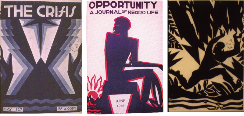
Samples of Aaron Douglas' work.
In 2016, the Smithsonian American Art Museum organized the exhibit Harlem Heroes: Photographs by Carl Van Vechten to help celebrate the opening of the new National Museum of African American History and Culture. Complex like America, the material consists of photographic portraits taken by a privileged, married, and gay white man enamored with black culture. Van Vechten began his career as a writer, taking up photography later when book royalties and a family inheritance allowed him to create without expectations of financial compensation. Although Van Vechten spent a great deal of his time engaged with the people and places of Harlem, he lived in a Central Park West apartment. It was there he invited friends, and friends of friends to come for visits and have their portraits taken.
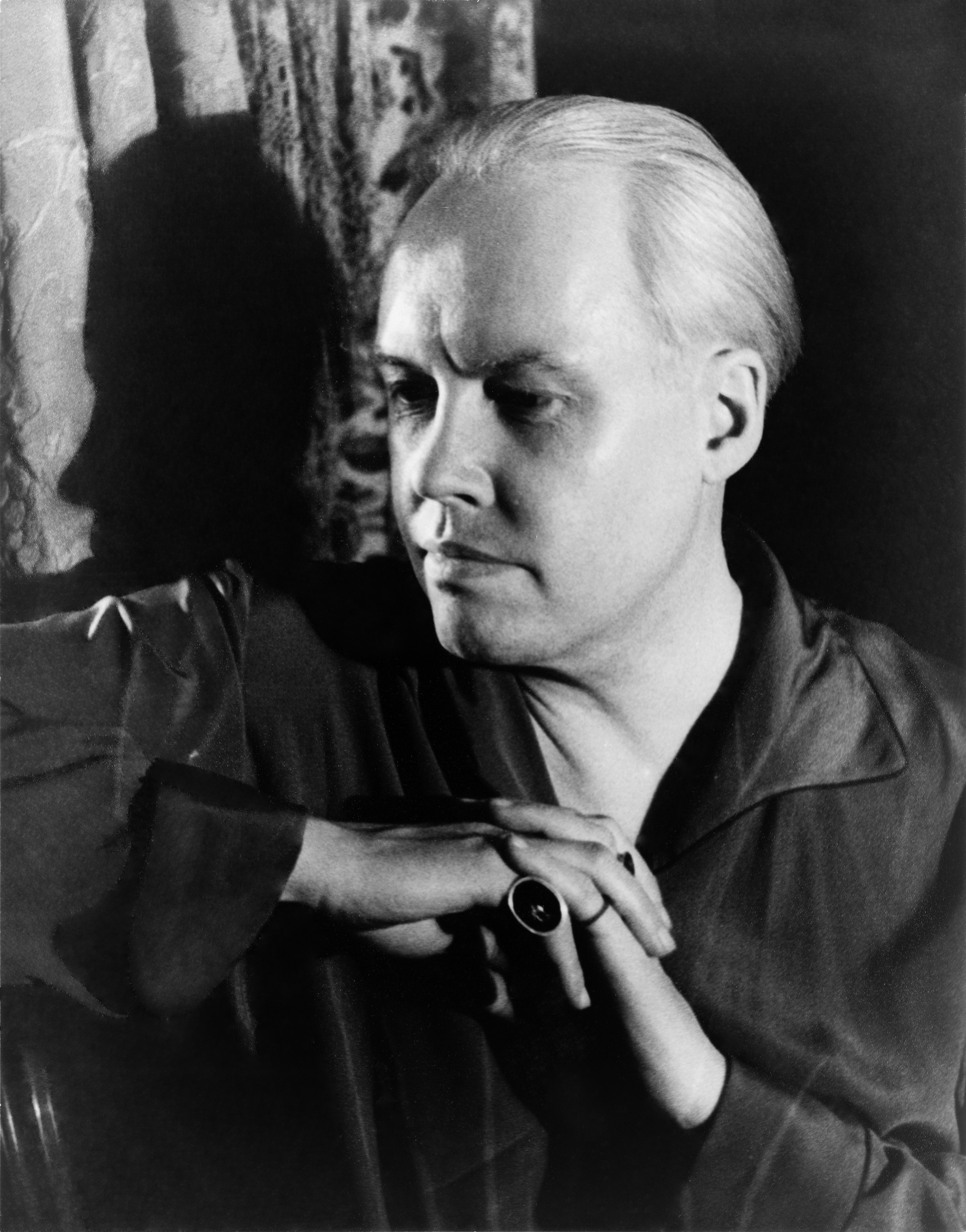
Self-portrait by Carl Van Vechten
Van Vechten’s modernist-infused portraits are spectacular records of some of the greatest figures of early 20th century American culture: W. E. B. Du Bois, Zora Neale Hurston, Bessie Smith, Paul Robeson, Langston Hughes, and Hoarce Pippin, among many other notables. These creatives helped shape our writing, our language, our music, and our visual arts. In was a great privilege and opportunity when the Smithsonian hired me to design the exhibition catalogue.
_by_Carl_Van_Vechten.jpg)
Bessie Smith, by Carl Van Vechten
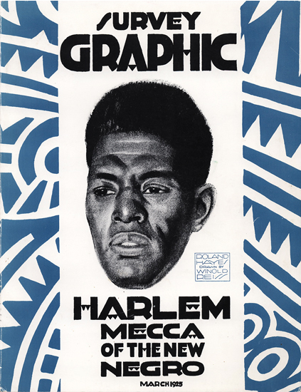
After reading the preliminary text and looking at photos provided by the museum, my next step was to revisit the images my student wrote about in his thesis project. Among the examples he presented was a powerful cover of the journal Survey Graphic from 1925. The issue, guest edited by Alain Locke, is devoted to highlighting work produced by artists and writers of the Harlem Renaissance. I proposed creating a title treatment for the book using letterforms adapted from those created by Winold Reiss for the journal. Interestingly, Reiss, mentor to the great artist Aaron Douglas, was a white German immigrant.
Winold Reiss cover
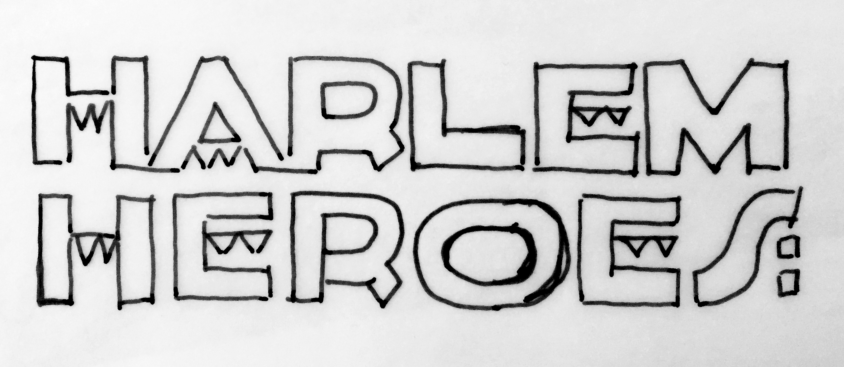
Lettering sketch and final title lettering by Studio A
The exhibition catalogue’s dimensions are determined in large part by my desire to reproduce the images as full-page reproductions, without cropping. Rather than seeing each photograph surrounded by a white border suggesting a framed artifact, the full-page image encourages a more intimate experience of the person in the portrait. As one looks at each photograph, the viewer is positioned inside Van Vechten’s apartment, watching as these intimate portraits are taken.
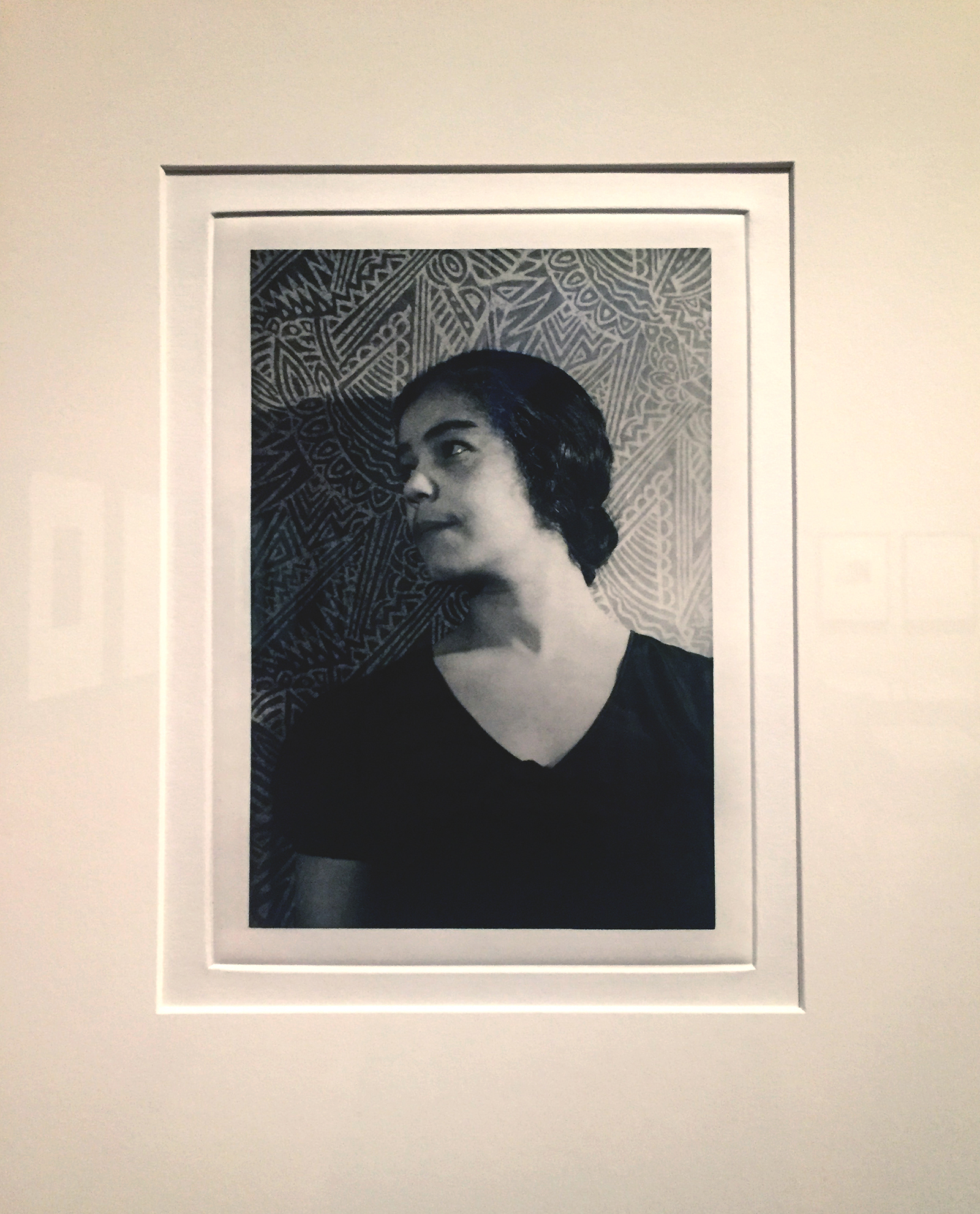
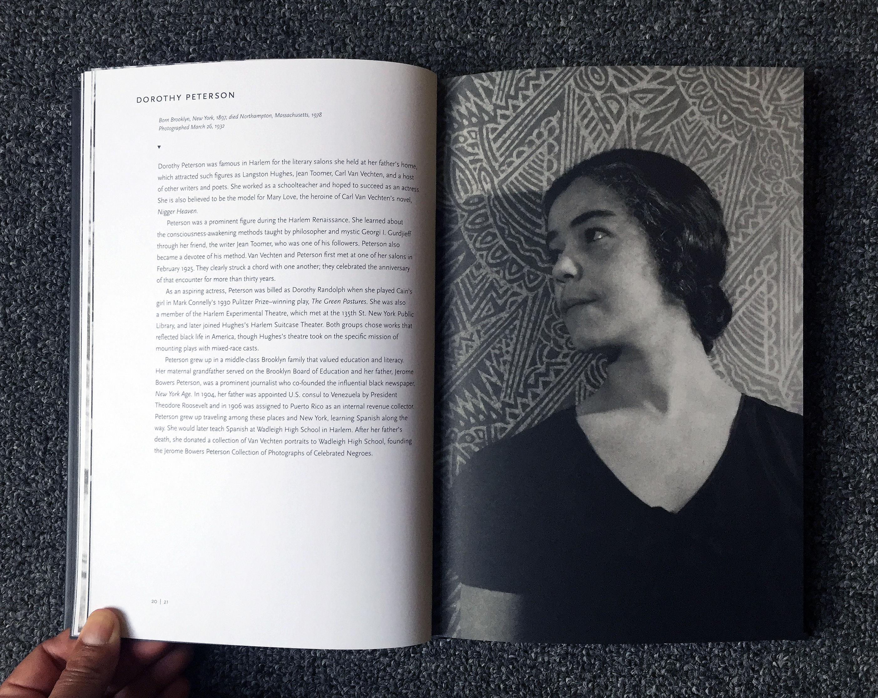
Photo of Dorothy Peterson in “Harlem Heroes” exhibition and same portrait in the catalogue.
Additionally, I wanted the reader to understand that these were not like James Van Der Zee’s portraits, images created by a black photographer in a studio in Harlem. These are portraits Van Vechten took in his Central Park West apartment, where he had his subjects come to visit and pose, far from daily life in Harlem. In the Library of Congress, I found a photo Van Vechten shot from his apartment that shows a view of Central Park West looking towards mid-town Manhattan. I used a crop of this image for the title page in an attempt to add context to the portraits that followed. Many other decisions, often transparent, go into the design of an exhibition catalogue, to help reveal the story of its contents.
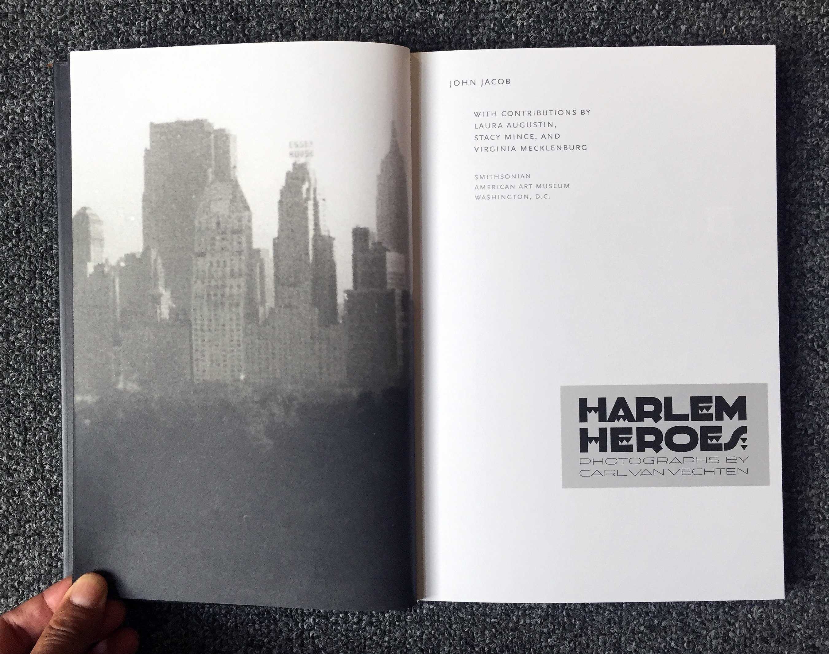
Title page from exhibition catalogue.
It was an honor and a privilege helping to bring these beautiful images of important creative black Americans to the public, even though they are laced with cultural ironies that become clearer with time. But all stories in America are complicated, and they all deserve to be told.