Artist, designer, critic, and California native Grace Clements was a founding member of the Postsurrealists, a contrarian art movement. In the group’s manifesto, titled “New Content–New Form,” published in the leftist journal Art Front in March 1936, she argued for art to address social concerns not through academic formalism but through a language ordinary people could understand. To this end, she advised artists to emulate the populist techniques of movies. Clements was also a prolific contributor to Arts & Architecture, the Los Angeles–based magazine that helped bring global attention to West Coast art, architecture, and design from 1929 until 1967.
Her elaborate Works Progress Administration project for the Long Beach Airport involved ceramic mosaics on the floors and painted murals on the walls, which together occupied more than 4,300 square feet. Art historian Michael Duncan describes the murals as centering on themes of land, water, and air, with interlocking areas depicting technical equipment, maps, scientific diagrams, and landscape, as well as methods of transportation and communication including ships, aircraft, and the telephone. This combination of motifs, says Duncan, echoed the early experimental film technique of montage and thus infused the murals with the spirit of Postsurrealism.
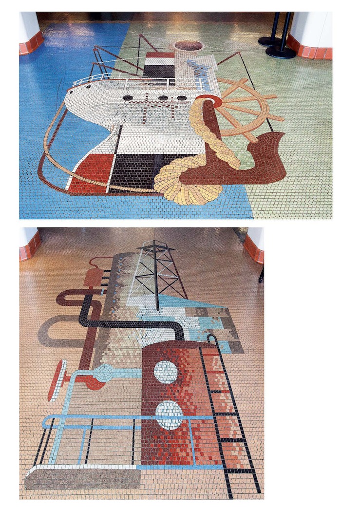
Grace Richardson Clements (1905–1969), floor mosaics at Long Beach Airport, 1942
Like so many other designers of his generation, Charles Kratka (1922–2007) studied with Alvin Lustig at Art Center in 1947–48. He took a job with the Eames Office in 1947 but left six years later, frustrated by Charles Eames’s failure to acknowledge his contributions.
Stories conflict about the meaning and purpose of the mosaic murals Kratka designed for the LAX tunnels, one of several large interior projects he completed during a diverse career. Ethel Pattison, an airport information specialist for the City of Los Angeles who has been cataloging the LAX archives, says that “the mosaics were designed to make the approximately 300-foot tunnels seem shorter… and [Kratka’s] approach gave passengers something of interest to look at.”
Ann Proctor, director of volunteers at the LAX Flight Path Learning Center and Museum, remembers tour guides for school field trips comparing a walk alongside the mosaics to a trip eastward across the United States: the blue tiles at the entrance represent the Pacific, followed by browns, yellows, and oranges to evoke the heartland. “There was one line of red tile in the middle, and we’d say, ‘We’re halfway across now, in the Midwest.’ The blue on the other end, that was the Atlantic Ocean.” For his part, Kratka offered a different explanation, telling his daughter that the geometric compositions that lined the seven tunnels (only two of which remain) depicted the changing seasons.
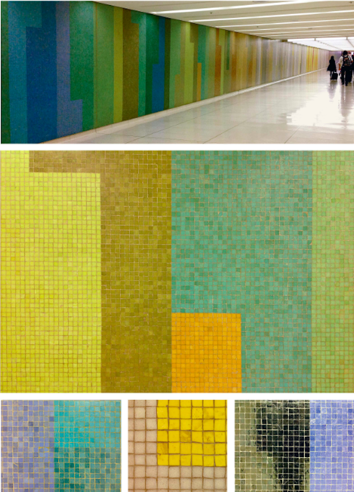
Charles Kratka's Murals for Los Angeles International Airport, 1961