At the heart of Stanford University, on the central campus, is a new addition—a small but significant museum called the Anderson Collection. News stories these days tend to focus on the university’s deep ties to Silicon Valley and the tech world, its support of the sciences at the expense of the humanities, but that is not the whole story. Stanford is quietly and quickly bolstering its commitment to the arts.
The university has built up an Arts District, including a large art museum, gallery, amphitheater, auditorium, and concert hall, with a building for the art and art history departments slated to open next year. Last month, The Anderson Collection opened.
The collection contains one hundred and twenty-one postwar American paintings and sculptures by eighty-six artists, many of them American masters. The work had packed the walls of Harry W. and Mary Margaret Anderson’s California ranch house. (There was an Albers and a Pollack in the bedroom of their daughter, Mary Patricia.) The Andersons spent fifty years building the collection. Richard Olcott, partner at Ennead Architects, designed the building that houses their gift to Stanford.
One of Olcott’s goals for the building was that it play nicely with its neighbors. This is no surprise—he is known for integrating contemporary architecture within existing settings, and he designed two other buildings in Stanford’s Arts District. The Anderson Collection is, in many ways, the ideal neighbor—quiet, keeps to itself, tidy yard. And it is similar to its neighbors: inoffensive, utilitarian, peach-colored.
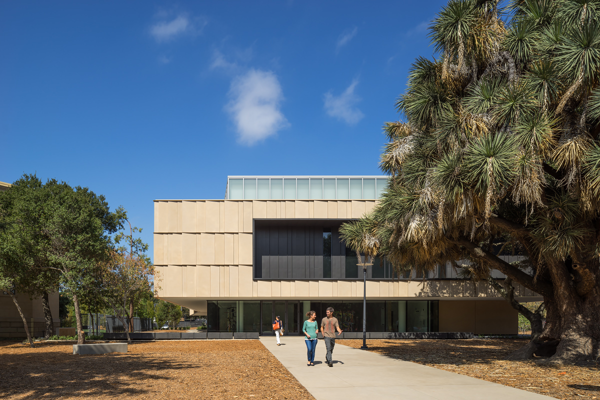
Exterior of the Anderson Collection building. Photo by Tim Griffiths
In this age of outrageous museum architecture, it is refreshing to experience a respectful, art-loving design, but there is a fine line between subtle and bland. The museum’s first floor (where the administrative and operational functions are located) feels more upscale regional airport than museum. The atmosphere—the way materials, tone, and light work together—is soothing and mild. It avoids the harsh white of a New York gallery or the bright branded palette of a temporary exhibition. Ten shades of soft white, warm gray concrete, pale wood, and ample natural light combine to produce a temperate, colorless effect.
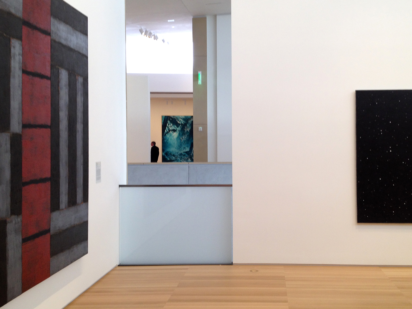
Gallery interior, view across the central staircase. On the left is Sean Scully's Red Ascending (1990) and Mark Tansey's Yosemite Falls (Homage to Watkins; 1993) across the atrium. Photo by Rachel Berger
In this age of outrageous museum architecture, it is refreshing to experience a respectful, art-loving design, but there is a fine line between subtle and bland. The museum’s first floor (where the administrative and operational functions are located) feels more upscale regional airport than museum. The atmosphere—the way materials, tone, and light work together—is soothing and mild. It avoids the harsh white of a New York gallery or the bright branded palette of a temporary exhibition. Ten shades of soft white, warm gray concrete, pale wood, and ample natural light combine to produce a temperate, colorless effect.
Gallery interior, view across the central staircase. On the left is Sean Scully's Red Ascending (1990) and Mark Tansey's Yosemite Falls (Homage to Watkins; 1993) across the atrium. Photo by Rachel Berger
Nevertheless, on the second floor, which is exclusively dedicated to art, the museum comes to life. It leaves polite behind, and becomes gracious. The works in the collection, diverse and often lovely, reflect the quirky tastes of a family with a passion for art but no particular expertise. Director Jason Linetzky has curated the collection with insight and sensitivity.
The galleries are open, and the groupings of works loose and generous. My favorite moments in the space came as a result of the open central staircase. Slices of work are visible across the galleries, making for a constantly changing view and putting disparate pieces in conversation with one another. The tilted ceiling creates a dynamic, varied setting for the art, while natural light pouring in through banks of screened windows is active and uplifting.
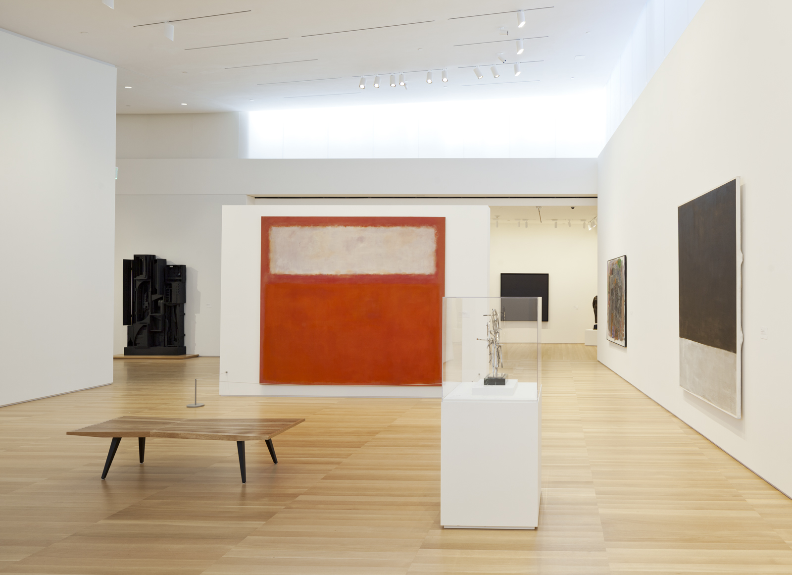
Gallery interior, with Mark Rothko's Pink and White over Red (1957) and Louise Nevelson's Sky Garden (1959–64) to the left. Photo © Henrik Kam
Two pieces in the collection stood out as particularly exciting for the way they played with or against the space: Robert Irwin’s disc painting (Untitled, 1969) and Bryan Hunt’s Fulcrum (1990). The Irwin is bewitching. It glows and floats in space, utterly alien, yet chiming with the gallery’s atmosphere. Fulcrum is like a splinter, a colorful spur that disrupts the pale symmetry of the panels flanking the staircase.
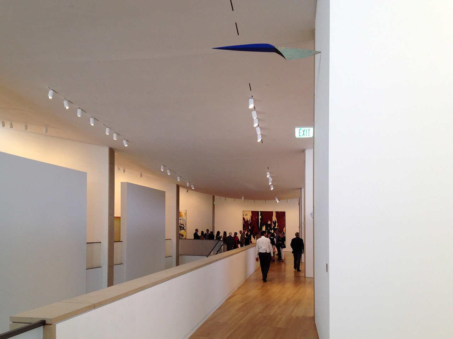 Gallery interior, with view of Bryan Hunt's Fulcrum (1990). Photo by Rachel Berger
Olcott intends his design to reflect the way the Andersons live and the way art is experienced in their home, with sprawling, informal, interconnected spaces. I experienced the museum in that way, yet the concept of home was elusive. I crave context, which means I’ll always prefer the Gardner to the MFA, always be fascinated and stirred by the setting as much as the work itself. Having seen images of the collection in it previous life in the Anderson home, I can't help wishing there were something homier about this new Anderson Collection. Still, I'm grateful it has been made available to all.
The Anderson Collection is free and open to the public.