My first-grade reading tutor gave the best stickers. Puffy, smelly, sparkly—she even had a few that were fuzzy. At that age I was a tornado of excitement. The last thing I wanted to do was settle down and sound out words, but the promise of tiny trophies on my spelling notebook proved to be persuasive. I remember how it felt to run my finger over the fuzzy stickers, but I can’t remember how it felt to struggle with reading. As a father I see clearly now just how steep the climb to literacy can be. The frustrating illogicalities of English are enough to reduce any child into a puddle of doubt.
Doubt is a prime example of why English can be so bewildering. The word isn’t spelled the way it sounds. Originally doubt was spelled dout. It was spelled this way because the word comes from the Old French word doute, and also because it just makes sense to spell it that way. Then sometime in the sixteenth century, around the birth of the dictionary, the powers that be decided they needed to imbue the common British tongue with the glow of ancient religious scripture. So they set about fabricating connections between English and Latin. The Old French word doute was inspired by the Latin word dubitum. And so a b was inserted into the English word doubt—phonology and emergent readers be damned. The dictionary is riddled with words that were separated from phonologically accurate spellings by the allure of Latin.
Some historians argue that other words were separated from phonologically accurate spellings in response to their letterforms. In medieval times Carolingian minuscule script was common and characterized by letters built from thick vertical strokes—also known as minims—with thin horizontal connectors. Picture a precursor to the blackletter masthead of The New York Times. Words with a critical mass of minims often proved illegible, especially if their delicate horizontal connectors faded. For example, without horizontal connections a word like minimum appears at a glance to be a series of 15 tightly spaced, but otherwise unrelated, vertical strokes. In response to this recurring legibility issue the letter u was replaced with the letter o in words with runs of minims like tun, which became ton. The letter c was also inserted before the letter k as a minim buffer in words like flik, which became flick.

To be fair, it should be acknowledged that the English we write today resulted from the convergence of a plurality of histories, and the shape of letterforms did not have an equally weighted influence across all of them. Many medieval scribal practices existed contemporaneously. Specifically, it was the Anglo-Norman scribes who made a focused effort to resolve the effect of minim sequences. Still, even though letterform inspired spelling adjustments heralded from a single branch of the English evolutionary tree, they did survive into current use.
Learning to read English is hard because it doesn’t make sense. At the heart of English’s nonsense is a persistent disconnect between its graphemes and phonemes. A grapheme is a letter, or a number of letters, that represents a sound in a word, and that sound is a phoneme. In his book Reading in the Brain cognitive neuroscientist Stanislas Dehaene notes that “Reading difficulty varies across countries and cultures, and English has probably the most difficult of all alphabetic writing systems. Its spelling system is by far the most opaque—each individual letter can be pronounced in umpteen different ways, and exceptions abound. Comparisons carried out internationally prove that such irregularities have a major impact on learning. Italian children, after a few months of schooling, can read practically any word, because Italian spelling is almost perfectly regular. No dictation or spelling exercises for these fortunate children: once they know how to pronounce each grapheme, they can read and write any speech sound.”
In the United States teachers guide students across this landscape of gerrymandered spelling and illogical pronunciation with the help of various leveled reading systems. The most common systems, which are sometimes used in concert, are the Guided Reading Level system, The Lexile Framework, and the Grade Level Equivalent system. Books are assessed and labelled with alphabetic or numeric levels which describe their difficulty. A student’s growth is measured by assessing their reading ability and promoting them up the levels as their reading fluency and comprehension improve. For example, in the Guided Reading Level system students begin with books labeled “level A” in Kindergarten, and by 5th grade they’re reading “level Z.”
A book’s reading level is defined by many criteria. In the Guided Reading Level system criteria include:
Length: Lower levels feature a small number of words, lines per page, and pages per book. Higher levels feature longer, denser texts.
Structure and organization: Lower levels feature simple, repetitive plots. Higher levels feature stories that require more interpretation.
Imagery: Lower levels feature pictures that portray the text literally to help students decode individual words. Higher levels feature less supportive pictures at a lower frequency.
Words: Lower levels feature high-frequency words. Higher levels feature multisyllabic words and a broader vocabulary.
Phrases and sentences: Lower levels feature simple sentences. Higher levels feature longer, more complex sentences with embedded clauses.
Literary features: Lower levels feature straightforward storytelling. Higher levels feature more complex devices such as flashbacks and metaphors.
Content and theme: Lower levels feature topics and themes that are familiar to younger children. Higher levels feature sophisticated themes that require background knowledge for comprehension.
Typography: Lower levels feature large point sizes with wide word and line spacing. Higher levels feature smaller point sizes with tighter word and line spacing.
The Guided Reading Level system acknowledges that typographic properties—referred to in education circles as perceptual features—play an important role in a student’s reading fluency and comprehension, but guidelines for typesetting leveled text rarely go much deeper than the preceding paragraph. Professional levelers often describe making typographic judgment calls based on sensibilities honed from countless hours of experience with leveled texts. In this way the typographic principles of leveled reading are a textual feedback loop that can limit input from professional designers.
Robust typesetting guidelines for leveled texts do exist, but primarily as internal support documents for design teams at educational publishers. These documents aren’t typically referenced by professional levelers, and it’s the levelers who define a book’s official reading level.
In the past I’ve been charged with leading the design of proprietary typographic leveling guidelines. I can report from firsthand experience that developing such guidelines is far less straightforward than you might imagine. Each of the leveling criteria listed above interact with each other, and with the properties of each typeface and book, in complex ways.
For example, it’s difficult to prescribe a specific point size for a specific reading level in the abstract without also prescribing a specific typeface and book size. Typographic properties like x-height (the height of the lowercase letters) and book properties like trim size (the size and aspect ratio of the book) have a dramatic impact on how large text feels irrespective of its point size.
But mandating a specific typeface across a range of books intended for reading instruction runs counter to the belief within education circles that having a diverse range of authentic texts for students is critical to their growth as readers. “Authentic texts” refer to books that weren’t written specifically as tools for use in reading instruction, like the “See Spot run” basal readers that were popular throughout the mid-to-late 20th century. So even if an educational publisher develops a library of leveled picture books specifically for use as tools in reading instruction the books can’t feel that way. Every book must feel unique.
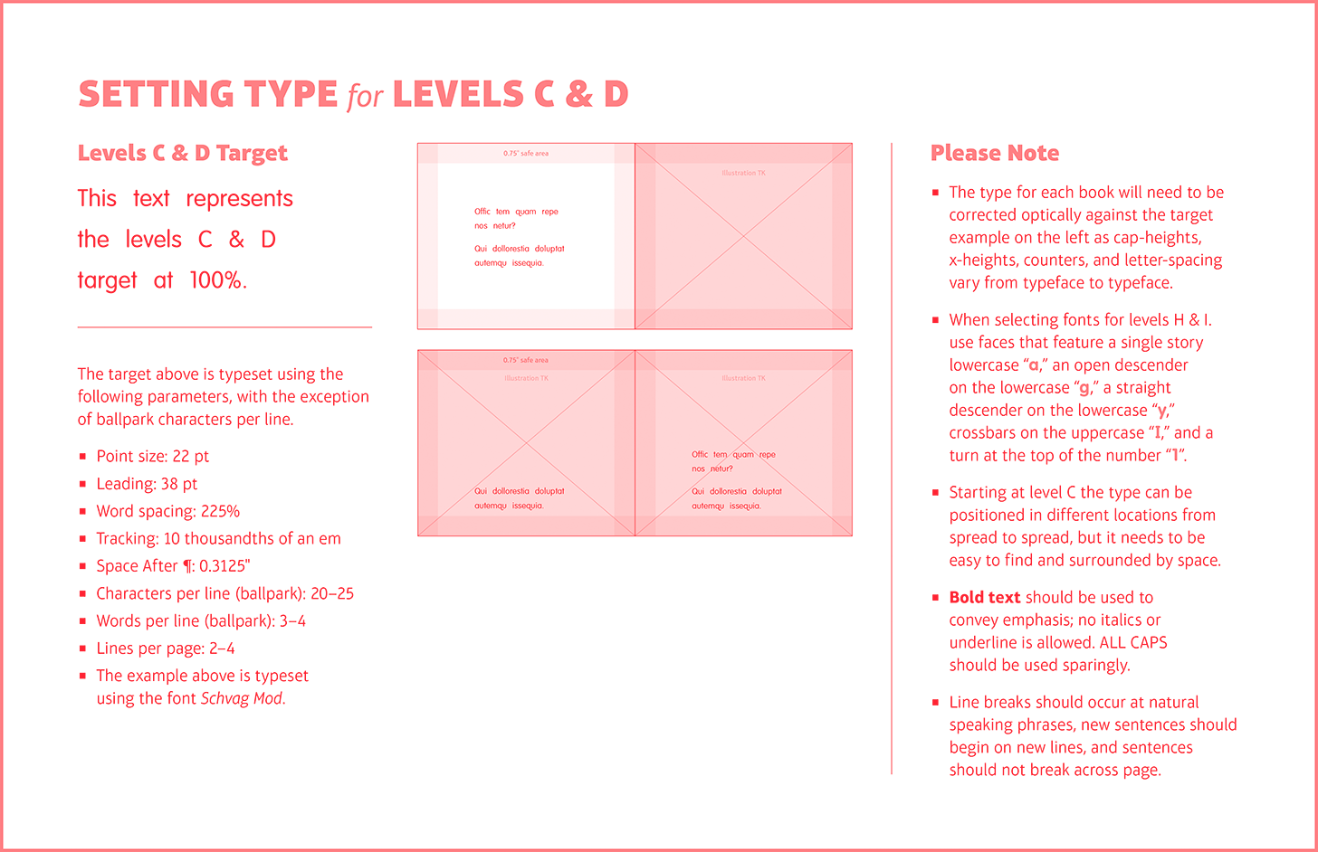
My solution was to develop a typesetting target—a paragraph of sample text that designers were asked to use to optically correct the size and spacing of their body text. But even after developing a full alphabet of leveled reading typesetting targets that were vetted and approved by our editorial and leveling teams, we still ran into exceptions. For example the gestalt of a tiny book, with a particular illustration style, reframed the typesetting target for that book’s level as too large in one particular case.
Building, and implementing, detailed typesetting guidelines for leveled texts is challenging, but the following research suggests that rising to this challenge produces measurable gains for young readers. Dr. Bonnie Shaver-Troup, an educational scholar, and Thomas Jockin, an educator and type designer, teamed up to develop a set of seven font families, collectively named Lexend, which were designed with the goal of improving reading fluency. Lexend’s variable width design rests on the foundational belief that “a font, much like the prescription in a pair of eyeglasses, should change based on the reader’s unique needs.”
In one study conducted by Dr. Shaver-Troup twenty third graders were asked to read for one minute in five fonts—New Times Roman (the control), and then four of the Lexend Series: Regular, Deca, Mega, and Giga. The text was typeset at 16 points and was a couple levels above the participants’ current grade level to “ensure the typography was being measured, rather than reading competency.” The students were asked to read aloud, and the number of correct words per minute was noted as an indication of fluency. Seventeen out of nineteen students had better fluency scores with Lexend than with New Times Roman. The use of Lexend resulted in a 19.8% instant fluency gain.
The majority of reading performance studies that have explored the effects of manipulating a text’s font, point size, line length, letter-, word-, and line-spacing have examined the impact of these perceptual features on reading rate and accuracy. Less frequently examined is the impact on reading comprehension.
In a study conducted by Dr. Tami Katzir, Dr. Shirley Hershko, and Dr. Vered Halamish, forty-five fifth graders were asked to read four age-appropriate texts. The control text was typeset using the same typographic properties that are commonly used in fifth grade textbooks. The other three texts were intentionally designed to be more difficult to read, using combinations of smaller point sizes and tighter spacing. Their hypothesis was that making the text less comfortable to read would slow students down, and their slower reading speed would lead to higher comprehension scores.
They found that using a smaller point size to achieve intentional disfluency produced an instant 10% gain in comprehension. Line length and spacing had less of an effect. They found this counterintuitive correlation between reading difficulty and improved comprehension was unique to older students and in fact found the inverse to be true with younger students.
The researchers summarized their observations succinctly: “The interaction between the reader and the text is not only content based, nor does it solely relate to factors such as background knowledge, proficiency in decoding, spelling etc. In fact, text presentation changes the way information is encoded and processed. This notion has been previously suggested for the reading rate and accuracy of young children. In the current research we suggest that a similar effect exists for higher level processing, i.e., reading comprehension.”
This concept of intentionally designing disfluent long-form reading experiences runs counter to many of the design and leveling community’s core principles. Designers and levelers are taught to prioritize readability above all. Dr. Katzir, Dr. Hershko, and Dr. Halamish’s research into “desirable difficulty” highlights the potential benefits of reviewing long-held typographic, and leveling, best practices through the lens of recent reading research.
Reading is a verb that speaks to what happens in a person’s mind. In school we practice reading until the action becomes automatic enough for the letterforms to tumble down into our subconscious. Perhaps this is why typography is sometimes framed as an afterthought—a decorative element that sits at a distance from the real business of ideas. But reading and the ideas that reading inspires aren’t a byproduct of a text’s meaning alone. The ideas we come to as a result of reading are inextricably bound with the physical identity of a text.
The leveling and design communities should further research the precise correlation between typography, fluency, and comprehension, with the goal of establishing more precise typographic recommendations for reading instruction. Doing so will produce instant fluency and comprehension gains for children who face the steep slope of English’s illogicality. Typography is a foothold that can help hoist children up over their doubts and onto the summit of their literate selves.
References
Bridges, Lois Bridges 26 April 2018. “All Children Deserve Access to Authentic Text.” EDU, edublog.scholastic.com/post/all-children-deserve-access-authentic-text#.
“Base Font Effect on Reading Performance.” Readability Matters, 1 Feb. 2020, readabilitymatters.org/articles/font-effect.
“Change the Way the World Reads.” Lexend, www.lexend.com/.
French, M. M. J., et al. “Changing Fonts in Education: How the Benefits Vary with Ability and Dyslexia.” The Journal of Educational Research, vol. 106, no. 4, 2013, pp. 301–304., doi:10.1080/00220671.2012.736430.
Katzir, Tami, et al. “The Effect of Font Size on Reading Comprehension on Second and Fifth Grade Children: Bigger Is Not Always Better.” PloS One, Public Library of Science, 19 Sept. 2013, www.ncbi.nlm.nih.gov/pmc/articles/PMC3777945/.
“The Old English Roots of Modern English Spelling.” The History of English Spelling, 2012, pp. 33–64., doi:10.1002/9781444342994.ch3.
“The Old English Roots of Modern English Spelling.” The History of English Spelling, 2012, pp. 33–64., doi:10.1002/9781444342994.ch3.
Pondiscio, Robert, and Kevin Mahnken. “Leveled Reading: The Making of a Literacy Myth.” The Thomas B. Fordham Institute, fordhaminstitute.org/national/commentary/leveled-reading-making-literacy-myth.
Reber, Rolf, et al. “Effects of Perceptual Fluency on Affective Judgments.” Psychological Science, vol. 9, no. 1, 1998, pp. 45–48., doi:10.1111/1467-9280.00008.
Refsnes, Hege. “Rejecting Instructional Level Theory.” Rejecting Instructional Level Theory | Shanahan on Literacy, shanahanonliteracy.com/blog/rejecting-instructional-level-theory.
Trask, Robert Lawrence, and Robert McColl Millar. Why Do Languages Change? Cambridge University Press, 2011.
Venezky, Richard L. The American Way of Spelling: the Structure and Origins of American English Orthography. Guilford Press, 1999.
“What Is Leveled Reading?” Scholastic, www.scholastic.com/teachers/articles/teaching-content/what-leveled-reading/.