STYLE …
In the 1986 film, Ruthless People, a convoluted comedy with an echo of “The Ransom of Red Chief,” Bette Midler plays the annoying wife of a businessman (Danny DeVito), who he plots to kill, before a pair of inept criminals kidnaps her. The layout of Midler and DeVito’s mansion is a prime example in how set design works to establish a feeling for personality. Midler’s irritating, shrewish, uber-rich-but-hopelessly-bourgeois character exists in a massive house filled with Memphis furniture, both authentic and ersatz. Chairs, tables, sideboards, coffee tables, picture frames—even a fireplace surround—are immediately recognizable as drawn from the brazen geometric, candy-colored vocabulary of the revolutionary design outfit from Milan. Only DeVito’s office is spared the treatment; his space is a classic gentleman’s oak study (read: sane and calm). But even the family poodle wears a multi-colored Lucite medallion around its neck!
When the kidnapped Midler bonds with one of her kidnappers (Helen Slater), it’s over Slater’s fashion designs, which are simplified textile renditions of Memphis patterns.
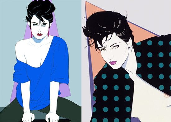
The 1980s began with a concurrence of stark design vectors, from Patrick Nagel and the severe women he created for Playboy and Duran Duran album covers, to Klaus Nomi and his acolytes at Fiorucci. That is: sharp angles, clashing colors, and bold shapes. Then along came Philippe Starck, putting a French edge to the bold aesthetic. His Starck Club in Dallas, Texas, was one of the greatest experiments in design cross-pollination in the United States during the 1980s. (Of course, then followed neon, day-glo, paisley, Katherine Hamnett, Body Glove, but as my academic colleagues say: "That is beyond the scope of this paper.")
Swid Powell Design, the company founded by two former designers for Knoll International, provided a sympathetic design thread in the 1980s—having architects design ceramic objects for household use. Robert A. M. Stern, Robert Venturi, Zaha Hadid, Frank Gehry—and perhaps most notably Michael Graves—branded Postmodernism for the consumer masses. Graves, in fact, is the strongest link between Po-Mo and Memphis, having played a starring role in both movements. (Here is where I get confused about the taxonomy of descriptors—if Memphis is Postmodern, then can Postmodernism be called Memphian?)
It is crucial to remember that the work of the Memphis collective had deep roots in design philosophy. Far from being just one more commercial pitch to consumers, the originator of Memphis, Ettore Sottsass, and many of his main designers were directly influenced by SuperStudio and ArchiZoom, two collectives born out of the Radical Architecture movement in Italy in the 1960s and ’70s. Both groups held, in their core beliefs, the rejection of tradition, order, planning, and monumentality. Instead, they drew from the philosophies of visionaries such as Umberto Eco, and were coincident with the groundswell that was 1968 when the radical became reality and Guy Debord’s plans for situations became reified on college campuses in Europe and the Americas. Both Superstudio and Archizoom were highly theoretical—their work often being as much about anti-architecture as they were about built forms.
The legacy they contributed to Memphis was a desire to do away with the austerity and rigidity of modernism and to remove the impetuses applied by consumerism. These—combined with a respect for Bauhaus and the realization that pure, vibrant color, form, and texture are as pleasing as they are ironic—fueled the mind blowing arrival of the first collection of furniture and decorative objects at the Milan Furniture Fair in 1981. And let’s not forget that there was a bit of Dada thrown in—especially in the naming department; products were often assigned titles by serendipity, often geographic or historical in nature: Manhattan, Cleopatra, Bombay, Brazil, Casablanca, Big Sur, Ontario, Titicaca, Broccoli, Euphrates … The group, formally “born” on December 11, 1980, was a multinational organization—including among its group American, Japanese, French, Austrian, Spanish, and English members—but the majority stake-holders were Italian, hence the frequent claim on Memphis as being a Italian design movement.
Keeping these philosophical roots in mind, Memphis can be seen as one of the most perfect situations accomplished in the twentieth century: more specifically, a decorative arts “constructed situation" in the classic mode of Debord (cue: eye-and-grave-rolling, but patience, please … ). It follows the model expertly crafted by Malcolm McLaren with his punk spectacle. It was an event of limited duration and progressed through: generation of bold, confrontational content released with much publicity; followed by angry critical backlash, but balanced by intellectual defense; then developed a cult following (for the pure form); and eventually ended with the integration of diminished aspects of the situation into the stream of broader popular culture. Sottsass bailed in 1985, eager to find another genius direction, but by then, the Memphis look had been co-opted, flattened, the edges sanded off—in short, diluted to a level safe for hotel lobbies and shopping malls.
In summary, perhaps the design formula for the decade of Memphis can be written as: Situationist Theory + Radical Architecture + Postmodernism + New Wave = Big ’80s!
VERSUS
On the Big ’80s tip, by the way, perhaps one of the closest analogues to Memphis in the popular American mindset is Pee Wee’s Playhouse. This brash, wildly inventive series operated with similar ethos of color, depth, geometry and playfulness. The interior of the Playhouse, designed by a team of talents including Gary Panter, Craig Bartlett, Richard Goleszowski, Gregory Harrison, Ric Heitzman, Phil Trumbo, and Wayne White, was drawn more from Americana and psychedelia—more Kenny Scharf than Keith Haring. But the roots of the show were similar to those of the Memphis collective: born of contradiction and an embrace of irony. Pee Wee Herman, the masterwork persona of Paul Reubens, began as an improv approximation of a terrible comedian, then morphed into an impatient and annoying host of a parody of a children’s television show, which became an real television show show for children—if Pinocchio evolved from hardword to soft flesh. (n.b. Paul Reubens’ turn as that very character in an episode of “Faerie Tale Theatre.”)
… COMFORT
One of the base arguments against Memphis is its lack of comfort. In the aforementioned scene from Ruthless People, a flummoxed DeVito tries to relax in a lounge chair, but due to its severe angles, he cannot sink into it comfortably. He would have been better off in a La-Z-Boy, that plebian stalwart of the American living room—a brand that is often employed as shorthand for bad taste.
The basic conflict, style versus comfort is not a new thing. Beidermeier furniture, which was originally crafted with comfort in mind, eventually grew more and more ornamental so that by the end of the nineteenth century, some offshoots of this broad style were overly fancy and too refined for everyday use.
The Style versus Comfort opposition extends to touch all areas of our designed lives—especially fashion. A succinct example of how comfort is associated with lower class values can be seen in that great comedic showcase Strangers with Candy. In the pilot episode for the series, the heroine, Jerri Blank, having returned to high school after decades as a runaway, encounters a group of popular girls in the school bathroom. They sneer at her ugly turtleneck and beige knit vest. When asked where she buys her clothes, she responds, “The Comfort Zone,” in a whimpering nasal drawl. And thus, she is a marked woman—dressing for comfort, rather than style. If the series were still running, Jerri would certainly be seen wearing Crocs® and a Snuggy®.
But wait! La-Z-Boy has aligned the two poles successfully—adding models to its line that hide their reclinability when upright, but which offer similar angles of repose for the exhausted, but discerning owner. They call this their “low profile” line. So there is indeed hope that both goals can be satisfied in a single object.
Maybe the formula now is: Irony + Time = Comfort. That is irony—the opposite of what we expect—softens as time goes by and eventually fits into context like a well-worn slipper.
There is really nothing to be scared of with Memphis—particularly if one sees it as one of the many efflorescences of radical rethinking in the twentieth century. The actual products of the Memphis Collective are idealized forms, rather than objects of everyday use. Even the maestro himself, Sottsass, stated that he would never think of having a room full of Memphis pieces. A single object serves to focus one on the function—and non-function—of the work.
Indeed, when one looks at the glazed teapots of Marco Zanini (“Colorado” and “Sepik”), it’s important to dismiss any frustration about how they could not possibly work as kitchen apparatuses. Put them on a shelf and admire them as beautifully crafted and glazed ceramic objects. They do provide a sort of comfort, aesthetically, to be admired from the plush armchair of your choosing.
NOTE: Many products from the original Memphis line are still in production and available through their online store.


Comments [2]
11.26.14
06:47
12.06.14
10:41